Sunday, February 26, 2006

Olive and Burgundy Arabesque

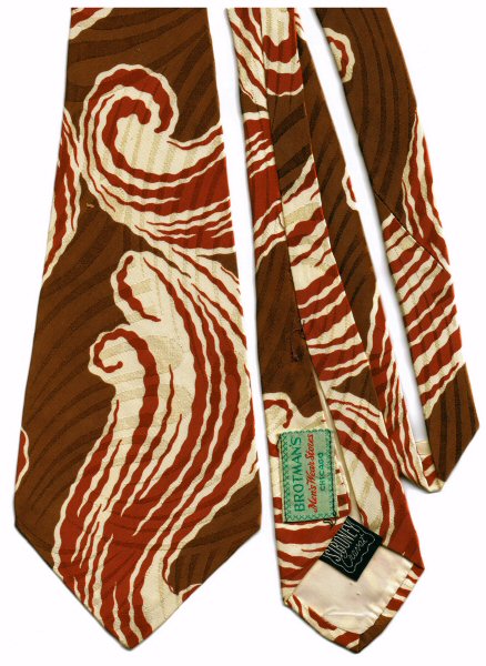
This tie was purchased in California, at an antique store in downtown Santa Cruz, if I remember correctly. That would have been in 1996 or 1997, whichever year ALA (the American Library Association) held its annual conference in San Francisco.

Arline and I went, my trip paid by my employer of the time, Amigos, and Arline getting at least part of her expenses paid by her employer, SMU (Southern Methodist University). We stayed on for a week after the conference, and after spending a couple of days doing the tourist thing in San Francisco, traveled on down to San Jose by train, where Arline's sister Kathy and her husband Ken, picked us up and took us over the mountain to Santa Cruz, where they still live to this day.

Arline had seen this tie when she had been there a year before, but had selected a different one to buy for me as a gift. When we visited the store again (again for them, first time for me) this tie was still there, and I coveted it, and so bought it, rather than risk breaking the 10th commandment.

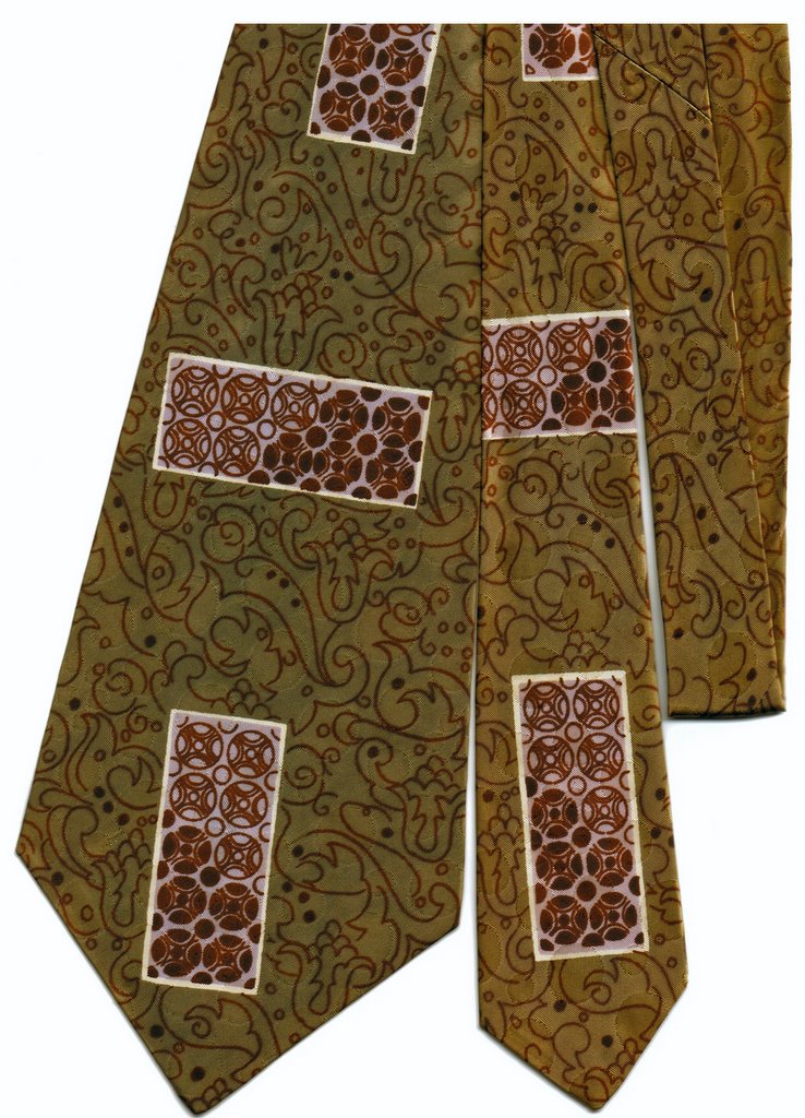
Unfortunately, I'm not sure if the scanned image will allow you to see the brocade pattern which consists of closely spaced circular dots of variing sizes. They are mirrored by the maroon circular patterns contained in the rectangular boxes. The tie has a label which reads "made and styled in california for Penney's".

Sunday, February 19, 2006

Rust and cream swirl

This tie gains excitment via its dramatic rust and cream swirl on a background of basic brown with a horizontally flowing linear brocade pattern. It is a relatively recent addition to my collection meaning that I acquired it sometime within the past decade or so, rather than early in my collecting career.

Beyond that, there's not really much to say about it. I don't remember the exact particulars of where and when i acquired it. It might be one that my wife found in her peripatetic perigrinations through the second-hand shops and antique venues in whatever towns we found ourselves inhabiting or visiting. Junk stores, we call them, and checking them out has always been one of our forms of entertainment.

The green label reads "BROTMAN'S Men's Wear Stores Chicago" while the black one elegantly asserts "SIBONEY Cravat."

Sunday, February 12, 2006

Navy with lighter blue and yellow

This is my favorite navy blue exemplar. Why? Several reasons:

  • The light blue patches make it easier to match it up with an outfit: light blue shirt, navy slacks, etc.
  • The yellow spots make a nice contrast to the blue, and help give the tie definition against the shirt
  • The lovely abstract brocade woven into the fabric is an especially nice touch

It's just a beautiful tie all the way around.

BTW, the blue blob in the lower left corner is the tie's label. If you click on the image, you'll get a slightly larger version in your browser, but the label is still difficult to read. The label states
"Resilient Construction"
"Towncraft DeLuxe Cravat"
"Fabric Loomed in U.S.A."

Sunday, February 05, 2006

Light blue floral

This is another of my wife's favorites. Mine too, for that matter.

What makes it unique is the lighter blue shade which predominates. By far the vast majority of vintage blue ties I own are deep dark navy blue. Deep blue and red together (as in Dad's red and blue paisley) are a typical combination as well. But lighter shades of blue are less common, at least in MY collection.

This tie poses a problem for modern wardrobes. It is really difficult to find a shirt color that it goes with, other than pure white. Of course, in the 40's, when these ties were designed and manufactured, white was the just about the ONLY color of dress shirt worn by men. But nowadays, I personally try to avoid white shirts as much as possible. So wearing this particular tie is always a challenge. But definitely worth the effort.