Sunday, May 27, 2007

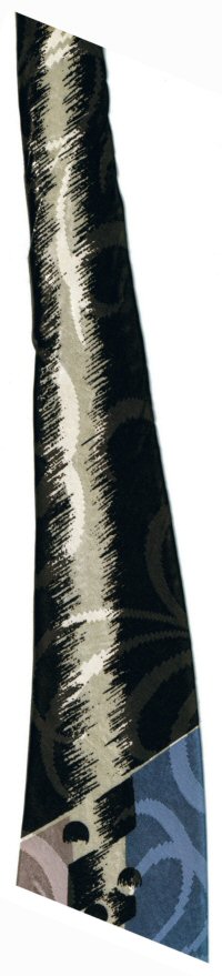
Silver, with Black and Gold Ornament

This may be the last in the recent series of what I've been calling vaguely heraldic pseudo fleur de lis designs. I'll have to hunt carefully through my collection next week to see if I can come up with any more, but I'm not aware of any off the cuff, so to speak.

Is it mixing metaphors while referring to ties, to use the expression "off the cuff?" I don't know, but at least it's a clothing-related expression.

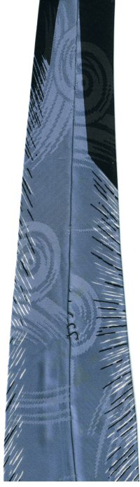
I think this is the first time I've placed the small end of the tie over the top of the large end in my scan. I tried it initially the other way, but as you can see, in the arrangement I used, the design on the small half would have been directly behind the large end, and wouldn't have showed at all.

I decided it made more sense to see the design twice, rather than just viewing an uninterrupted stretch of those groups of four parallel lines, resembling blank music staves.

I have fairly good reason to believe that this tie was once wider, a true four-plus incher, but that as tie fashions narrowed, someone took it to a tailor and had it cut down, or re-folded. I've always been suspicious of the fact that the design is off center. For this kind of symmetrical design, you'd expect it to be precisely centered on the tie, not visibly closer to the left side, as it is now.

Next, when you examine the tie in the back, the silver fabric comes all the way to the edge of the tie on one side, but on the other side, the silver fabric has been folded under, which is not normal construction for a tie. And the silver fabric overlaps significantly in back, again, not normal. The two sides are sewn up the middle with loose stitching.

I'm considering undoing the stitching, having the tie dry cleaned flat, with no crease, and see if I can refold it to approximate what I believe to have been its original wider size. If and when I do, I'll have to post another picture for your benefit.

The tie has one label, sowed in lengthwise on the small end. It is presumably a seller's label, although I suppose it could be the manufacturer. It sounds like the name of a prestigious law firm:
Woodward & Lothrop
Washington
The two lines of the label are separated by a fancy typographic ornament.

Sunday, May 20, 2007

Silver, Yellow and Blue

Yet another in the series of vaguely heraldic, pseudo fleur de lis designs. This one is a change from all of those that went before, in that, instead of the designs being scattered somewhat randomly or even evenly over the surface of the tie, here we have a rigidly symmetrical design.

One elaborate design suspended, chandelier-like from one of the two geometric crossing points on the tie, with a very close imitation of the fleur de lis above, picked out in a reverse colored white on navy. The petals on either side are too small, and the central flower is diamond shaped on the outside, rounded on the inside, but if you compare this shape to the classic fleur de lis design as shown on Wikipedia, you can't help but notice the resemblance, even though skewed somewhat.

You should be able to see the elaborate leaf-patterned brocade woven into the fabric. It shows up best on the central silver panel, although it flows through the entire tie, equally. Unfortunately, in the scan, the brocade is not visible in the deep navy blue sections of the tie.

The tie is another narrower example, measuring only 3 3/8 inches across at its widest point. There are no extant labels to record. A very nice, obviously expensive tie in its day, but nevertheless, not one of my favorites, for a couple of reasons: First, it's not wide enough! I like those 4+ inchers. Second, I prefer the more abstract freer-form designs to the rigid symmetry displayed here. I said a couple of reasons, but here's a third: Yellow just isn't my favorite color.

Sunday, May 13, 2007

Gray-blue with Flourishes and Squiggles

The squiggles are the angle bracket markings which cover the surface of this tie.

The other patterns I'm calling "flourishes" today, because they aren't quite as heraldic nor do they probably even qualify as pseudo fleur de lis, like the designs on the ties from the past 3 weeks.

In comparison with those, these flourishes make me think of Paul Klee and his "Twittering Machine." I guess because they are more thinly drawn, and composed of less substance, somehow, than the vaguely heraldic designs of the past weeks.

That's about as far as the resemblance to Klee goes, and it's not much a of real resemblance, I grant you. But the thought passed through my head, so I had to mention it. That's what blogs are for, right?

It is perhaps worth noting that the back side of the tie is a slightly brighter shade of blue than the front, suggesting that the front of the tie has faded somewhat over the years. Fading usually comes from exposure to the sun, and that seems a bit hard to countenance, given that the tie was originally sold in Seattle, and I found it somewhere in the NW also. One wouldn't think a tie worn in these parts would get enough sun exposure to fade!

This tie strikes me as another less expensive example, like the one from April 15, mainly because it is not made from a brocaded fabric. But I may be completely off base, since the fabric is an all silk foulard, according to one of the labels. Per usual, when two labels survive, one is the seller's label, and one the manufacturer's. They read as follows:
Rhodes
Department Store
Seattle
and
Devonshire
Foulard
All Silk
The term "foulard" is an interesting one. Read some web definitions via Google here.

Sunday, May 06, 2007

Silvery Gray & Red

Here's yet another tie with those vaguely heraldic pseudo Fleur de lis type symbols scattered about on it.

This one has a lovely brocade woven into the fabric, with overlapping circles filled with a checkerboard type cross hatching pattern, the circles surrounded by circular, oval and even somewhat paisley shaped objects, arranged around the circles somewhat like flower petals.

I've also loaded a couple of closeup detail images, showing the two versions of the heraldic devices. The first one is mostly red, with white and gray highlights, while the other is partly white, partly red.

The upper central portion of these designs almost resembles a human figure, raising its hands (or wings?) above its head.

This tie, like the one from last week, is only 3 1/2 inches across at its widest point. Unlike last week's, this one has no surviving labels to record.

The brocaded fabric is beautifully designed, but the tie itself is, in my view, on the boring side. The color, gray, is not exciting, and these vaguely heraldic designs project a more conservative, traditional image than do the freer, more abstract designs that I prefer. Still, it's a definitely a tie worth having in my collection. To be honest, I'm not sure if I've ever worn it. I suppose I ought to find an appropriate shirt, and wear it to work, some of these days.

Sunday, April 29, 2007

Blue and Silver with Crimson Highlights

Here's another vaguely heraldic, not quite Fleur de lis, continuing the trend from last week. This is a prettier color combination, though, at least in my view. My only complaint about this tie is its slightly narrow width, measuring as it does, a mere 3 1/2 inches at its widest point.

What are those repeated shapes on the tie? The bottom part looks like bird wings. The top almost, but not quite, resembles a ship's anchor.

The fabric is richly brocaded with an inlaid pattern of crosshatched squares, turned on their sides to form diamond shapes.

So from what time period does this tie hail? I'm not positive, but it has that 1940's look. The slightly narrow width could indicate the beginning or end of the wide tie era, although I don't know that for sure.

The tie has a single label, sewed into the narrow end, which, printed in an elaborate script, reads simply,
The Bon Marché.
This grand old store, for over a century synonymous with good shopping in Seattle, is unfortunately no more. It was bought out, and its vintage name replaced with that of Macy's in 2004. To read the history of the store, check out this article on HistoryLink.org, which calls itself The Online Encyclopedia of Washington State History.
Sunday, April 22, 2007

Not quite Fleur de lis

Here's another vintage tie with a rich brocaded fabric, but not, I have to admit, one of my favorites. I prefer the more abstract designs. This one looks like it's trying to be vaguely heraldic, imitating but deliberately avoiding the classic French Fleur de lis pattern.

And its chocolate brown background color is not my favorite, either. Brown, yellow and red, together. Not exactly a favorite color combination for me.

Nevertheless, it was probably an expensive tie in its time, and as a collector, when you find a vintage specimen for a reasonable price, you grab it. Although to be honest, it's my wife you probably found and grabbed this particular item. But the fact still remains: in this day and age, the vintage tie collector has to take what he (or she) can get.

This one does have good width, 4 1/4 inches at its widest point, albeit that is a quarter of an inch narrower than last week's specimen. No labels.

Sunday, April 15, 2007

Red, White and Gray--Spots!

Now that I've finished displaying my thirties era ties, it's back to the bigger and bolder forties. Even here, I'm afraid that many of my most colorful and opulent examples have already been featured, so it's on to the more ordinary, probably less expensive in their day, examples.

Take this relatively prosaic pattern of uniformly distributed red and white circles on a gray background. Not even any particular creativity in the positioning of the dotty spots. Just evenly spaced alternating rows. And no fancy fabric with embedded brocade patterns here. What you see is what you get.

It is worth noting that the red circles, ovals actually, are shadowed , while the white ones are not. To me, this tie looks like something that would be worn by Bozo the Clown! About the only thing it has going for it is it's extreme width, fully 4 1/2 inches across at its widest point, just before it tapers to its inevitable point. The width does make its own kind of statement. No shrinking violet, this!

The tie does have one label extant, which states:
Made in California
The word "California" is set in a fancy script style font, and a palm tree graces one corner of the label.

Sunday, April 08, 2007

The Last from the Thirties

Holy Week can be a sort of "hell week" for church organists, such as myself. Simply because of the thousands of notes to practice and perfect. And the extra musical events, extra music, period, for which to prepare.

That explains why no tie got posted last weekend. I had my regular Sunday service in the morning, then several hours of practice, followed by a hymn sing that evening. The next day I played a 30 minute noon recital sponsored by the local chapter of the American Guild of Organists, of which I am dean.

I practiced Tuesday evening, Wednesday evening, and Thursday evening there was a Maundy Thursday communion service to play for, with the final Easter choir rehearsal afterwards.

Saturday afternoon saw a couple more hours of final practicing for the big Sunday Easter celebration, which included no fewer than six big choir anthems, culminating in The Hallelujah Chorus from Handel's Messiah, which has to be one of the most difficult pieces to play in the entire repetoire.

All of that effort comes together in a very rewarding fashion, but it's still very tiring, very labor intensive, a lot of hard work!

But this is supposed to be a blog about ties, not about church music. This is, so far as I have been able to determine, the last of my 1930 era ties. If I have any more, they're hiding. I call this one "Leaves of silver, blue and copper on a burgundy background." It's one of the more glamorous entries in these richly fabricated ties that I have been featuring since January first, this year.

I'm also loading a second image, of both ends of the tie from the back side, primarily to show another unique characteristic of 1930-era ties. These ties are invariably put together in an off-centered fashion. Look closely at the image of the back side of the tie, and you will see that the fold where the two sides of the tie come meet and are stitched together, are not centered, but are severely lopsided.

This is the way all of these ties are put together, and is quite distinct from most ties of later vintage, which, if not perfectly symmetrical, are generally more so than these. You can see a couple more examples, albeit only of the small ends, by taking another look at "Red Paisley" and "Red Spiderweb," both of which show the back side of the small end of the tie.

"Red Spiderweb" definitely shows the lopsided stitching, while "Red Paisley" is a little more centered, but demonstrates another aspect of these ties: looser stitching. These ties are typically only loosely stitched together in back, unlike later examples, which are generally more tightly and evenly stitched.

So, now that we're done with the thirties, at least for the time being, what next? I haven't decided, so you'll have to wait (with me) until next week to find out.

Sunday, March 25, 2007

Maroon and Blue with Silver Trimings

I think I've finally figured out the trick to adjusting the images of my maroon ties so that they appear correctly on screen, at least on MY monitor. I can't guarantee how they appear on YOURS.

As I mentioned a couple of weeks ago, I have the red vs. cyan and blue vs. yellow sliders all the way toward red and blue, and then I adjust the green vs. magenta slider back just a little from all the way toward green, to get exactly the correct shade of maroon.

Then I can play with the automatic brightness and contrast, hue and saturation controls to further enhance the image. My goal is always to make the tie appear on screen the way it looks when I hold it in my hand. I am particularly pleased at how this one turned out. The blue is such a brilliant and vibrant shade that contrasts so vividly against the maroon.

Now that I've got a better handle on how this works, I probably ought to go back and play with some of the earlier samples that I couldn't get quite right before. If I ever have time, I will probably do so.

This tie's labels are showing, albeit upside down on the image. They read as follows:
The Bon Marché
Seattle
and
Fashion
Craft
Cravats.

Sunday, March 18, 2007

Tiny Paisley Print

Are these really paisley's? The little pink/red shapes scattered evenly across this tie? They are too small, and don't have enough detail to be absolutely certain, but their shapes are certainly reminiscent of paisleys, so I'm going to assume that that is how they were indeed intended.

I don't know what to call the paired silver shapes that alternate with them. They could almost be commas or apostrophes, or perhaps bent bowling pins, or maybe telephone receivers (probably not). Whatever they are, they add their own glossy glistening glissade, gliding down the face of the tie like glad glib and glorious globules of glossolalia.

I have to admit that "glissade" and probably "glossolalia" and "globules" for that matter, are only marginally apropos to my usage of them in describing this tie, but I couldn't resist the alliteration.

This tie amazingly has two labels still attached, shown in the scan. The first reads
The H.C. Capwell Co.
Store for Men
Oakland
And the second a single word:
Eton

Sunday, March 11, 2007

Maroon Coils and Silver Bubbles

Once again I had to struggle with my scanner's inability to handle shades of maroon. The scanner picks this range of colors up as a dull brown, with none of the real shades of red and blue that it should be resolving. I had to run the image through my image editing software (I use Jasc Paint Shop Pro 8) , and manually adjust the Red vs. Cyan, Green vs. Magenta and Blue vs. Yellow sliders, most of them heavily toward the right (Red, Green and Blue), to get an approximation of the right shade.

Until I ran this scan, and began trying to "fix" the color, I had never even noticed that in addition to the silver colored "bubbles" (that's what I'm calling them), there are also some red bubbles, almost identical in shape, but barely discernible against the dark maroon background. I don't know if you'll be able to spot them or not. It may help to click on the image for a larger version.

This is obviously another in my 2007 series of 1930's era ties. I think I'm getting close to the end of these. I know I have at least one more, and there might be some others lurking in my myriads of tie racks that I will be able to seek out if I hunt for them. At any rate, it probably won't be too much longer before I'm back to the more colorful 40's era ties that I started out displaying on this blog.

This tie has no labels to report on, so that's about it until next week! See you then!

Sunday, March 04, 2007

Green and Brown Swirled Lines


So far all the thirties era ties I've posted have been either red, maroon, or blue. So I decided it was time to switch colors, and the result is this brown and green exemplar. Although the thin lines with the more brightly colored dots and dashes on them include a red color, probably not highly visible in the scanned image.

I've decided to load a second image this week, showing the inside of the tie, or to be more accurate, the reverse side of the fabric, so that you can see you these designs are created.

When you look at the image, the brightly colored parallel stripes you see running across the fabric are the little brightly colored dots on the narrow stripes on the front. Those dots are created by threads that run clear across the fabric, but somehow they are only allowed to show through to the front whenever they cross one of the swirly lines that curve across the face of the tie.

Incidentally, those lines you see on the reverse side of the tie would be running in absolutely straight lines across the tie, if the tie weren't folded a little. It's hard to keep the tie absolutely flat while trying to close the scanner lid down on the tie, since I've unfolded the tie along its creases, to show more of the fabric backside. So the lines all curve where the tie managed to fold in on itself.

Well, I'm sure I'm boring the life out of anyone who is actually trying to read this entry. Just look at the tie, and ignore my unnecessary verbiage. So until next week, au revoir.

P.S. I have just (8/12/07) reloaded a newly edited version of the primary scan for this tie. The previous version was so dark that it was almost impossible to make out any detail on the tie. I certainly don't recall it being that dark when I originally loaded it, but it certainly looked dark now. This version still isn't accurate color wise, but at least you can make out some of the detail.

Sunday, February 25, 2007

Brushstroke Swirls

Another '30's era tie. This one I'm calling "Brushstroke Swirls" for lack of anything better. My scanner really seems to have problems with dark shades of maroon. I had to really run this scan through the image enhancement software process in a major way to get it to come even close to the actual color.

It's pretty close now, but just a bit on the dark side. (Not the dark side of the force, mind you 8^)

I believe I mentioned embroidery in one of my previous 2007 entries. These ties have a unique kind of fabric that resembles embroidery, but unlike embroidery, the design is not stitched on TOP of the fabric, but is embedded into the fabric itself. I wish someone with more knowledge of fabric would explain it to me. How this fabric is made, that is, and what the proper terminology for it is.

I have said several times before that these scans don't really do it justice. But then, the ties themselves, from any distance at all, appear rather plain and ordinary, dull even. It's only when you take a look at them up close that you can perceive the richness, the sheen, the jewel-like colors, the elaborate stitching effect that is created. These ties are much more subtle than those from the next decade, but are not nearly as dramatic and flashy. But seen up close, they are just as stunningly beautiful. That's my view, anyhow, and I'm sticking to it!

Sunday, February 18, 2007

Maroon and Silver

Here's another Christmas present tie. This was part of the group of ties my wife purchased from the little antique shop in downtown Olympia, and gave me for my Christmas present from her. See my post from two weeks ago for the first one.

I'm not happy with the color cast from the scanner, and despite all I could do with my graphics editor, I couldn't really get the on screen version to match what I see when I hold the tie in my hand. Of course, I'm looking at the tie under incandescent light, and often colors look different than they do under either sunlight or fluorescent light.

The real color is more of a classic maroon than what I've captured on the scan. The contrasting patterns are fairly accurately captured, shiny silver, with occasional blue streaks in amongst the silver.

Not much else to say about the tie, except that like most of these thirties vintage, it is narrower, and looks fairly prosaic until you get up close and examine it carefully at close range. Then its brilliance and glamor become more apparently visible. No tags to record.

Sunday, February 11, 2007

Blue Number Two

Here's another blue beauty from the thirties. This on is more monochromatic even than last week's, but is still exhibits a brilliant sheen and shine replete with jewel like colors embedded into the fabric.

It doesn't really come through in the scan, but each of those patterns which dribble down the face of the tie, which somewhat resemble rivers on a map, is actually bi-colored, one side a lighter, glossier silverier shade of blue, and the other an almost maroon or reddish hue. The two colors cross over each other occasionally as they meander down the tie.

The small independently floating shapes are likewise made from the same two colors, paired together. It's a very subtle yet beautiful effect, especially when seen directly, not through the computer's attempt at recreating the colors. Click on the tie for a slightly larger version, where the two colored embroidery is a little more visible, though still not as clearly as in the actual tie itself, unfortunately.

This tie has a label which has survived! Fastened to the inside of the large end of the tie, it reads:
Li-Ro
Cravat
Hande Made
Wool Lined

Sunday, February 04, 2007

Blue Beauty

Take a look at this blue beauty! Narrower than the other thirties era ties I've posted, but just as dramatic in its own way. This tie has an almost patchwork quilt like quality to its design. For once, I think the scan has captured at least some of the brilliance and opulence of the fabric in this tie.

This tie was a Christmas present from my wife, who found it at a little antique shop in downtown Olympia, Washington, with three more, one of which I may post next week. Another is a forties era, which will have to wait until I decide to slide back into that decade, which won't be for a while yet. And the final one looks like a homemade tie, perhaps from the sixties. Attractive in its own way, but not appropriate for the blog at this time. Maybe someday.

We need to go back and check out the antique shop again, as they told my wife they thought they had more vintage ties, but that they just weren't sure exactly where they were. In a box in their storage somewhere, undoubtedly.

It's rare for labels to have survived in these thirties era ties, and this one is no exception. That is to say, there are no labels in it. And I've yet to wear it. I'll have to find the right outfit and occasion! I have a pair of navy corduroy slacks which have a bit of a sheen to them that will probably work nicely, perhaps with my gray-blue shirt. Time will tell.

Sunday, January 28, 2007

Red Paisley

No tie last week. I was out of town, not that far, but there was no time or energy for blogging, not to mention that I didn't have access to my scanner or tie collection in my hotel! I was attending the American Library Association's Annual Midwinter Meeting, which was conveniently held in Seattle this year.

Not only did I have umpteen meetings to attend, in some of which I had a significant leadership role, my body chose this moment to rebel on me, and I came down with my second dose this season of the "stomach flu," more accurately known as gastroenteritis. Not fun, I assure you! But I couldn't go home and collapse, since I was staying in a hotel, and had all those meetings to attend! Sometimes you just gotta do what ya gotta do.

Well, here is my third 1930's era tie for your appreciation (or not, as the case may be). It is really difficult to capture the real look of these opulent ties. On the surface, they can appear fairly boring. Just another red tie with paisley designs evenly spaced across the surface, you might well be thinking.

But if you could see this tie in person, in real life, you'd be impressed by the richness of the fabric, and the designs which have an almost embroidered look to them. Machine embroidery, to be sure, but the effect is rich, sumptuous, gilded and luxurious!

It is also difficult to capture the true colors accurately. To my eye, this tie is really a slightly brighter shade of red than it appears here, but the green is less so. It should have more of a grayish towards turquoise color, and less green to it. I play with my photo editing software, adjusting the color balance, hue and saturation, brightness and contrast, but to little or no avail.

This tie has no labels to record.

Sunday, January 14, 2007

Red Spiderweb

Here's the second in my series of thirties era ties. I had real trouble with the color in scanning this tie. To my eye, under an incandescent bulb, admittedly, it appears to be a more maroon shade of red than it shows up here. It's not maroon, just a maroonish shade of red.

What this tie has in common with last week's is the jewel-like quality of the fabric and design. Each spiderweb pattern has a little blue fabric jewel set right smack dab in the middle of it. They are only barely visible in the scan, I'm afraid. Click on the image to load a slightly larger view.

The spiderweb patterns themselves are made from a shiny silver colored thread, and the base fabric also has a lustrous shine to it. Opulent is a good word to describe the overall effect.

This tie is a fairly recent acquisition to my collection. In order to scan it, I took it off the dry cleaner's tie card it had been hanging on for the past several months. Which means I probably haven't ever worn it. My wife found it at one of her junk store haunts. Like pretty much every vintage tie we find, we sent it off to the cleaners first thing.

This tie has one label, shown in the scan, although I'm not sure how readable it is there. Even when I scan the labels, and provide a closeup view, as I've done for several ties in the past, I still transcribe the label text in the blog itself.

Why? For the benefit of the search engines, if nothing else. Google can't index the text in a picture, not yet, anyhow. Well, I probably shouldn't go so far as to say they CAN'T, but as a rule, so far as I know, they DON'T. By including the text of the label in the text of the blog entry, I insure that someone who might be looking for that brand, or label, will find my blog entry.

Anyhow, this tie's label reads as follows:
Reg. Trade Mark
Gold Bond Cravats
Resilient Construction

Sunday, January 07, 2007

Purple and Rose Thirties Era

It's been one full year since I began my vintage tie blog! Hard to believe. One tie a week for a year, except for one week when I didn't have time to post. I haven't actually counted, but I assume that means 51 ties.

I just went and checked the calendar. It appears that there were 53 Sundays in 2006, which should mean that I posted 52 ties last year. I'm not going to take the trouble to go through my entire blog and count up. I guess I could just go to my blog stats in my account and look there! But not while I'm writing a post.

Last year, New Year's Day fell on a Sunday, so I began this blog appropriately on January 1. So last Sunday was actually closer to being the anniversary date, being it was December 31. But it was also still in 2006. This is the first 2007 vintage tie posting.

Well enough with the self-congratulatory prose, and on with the ties! I've decided that for a while, at least, in 2007 I'm going to jump back a decade, and feature some of my 1930's era ties, of which this is the first.

How do I know whether a tie is from the thirties, as opposed to the forties? I don't, really, other than kind of by instinct and hints from what I've seen here and there. Going by what I've seen, ties in the thirties were a little more conservative in appearance, typically a little narrower (this tie is about 3 1/2 inches at its widest point, for example), and less obviously flashy in design. Yet no less elaborate. When you look at this tie closely, you find an ornate almost quilted design with beautifully colored fabrics with an almost gem-like quality to them.

The real colors on this particular tie were difficult to scan accurately. The large stylized leaf shaped objects are really a deep, beautiful plum-purple color which doesn't come through well in the scan. The background is a lovely rosy shade of pink which is fairly accurate on screen. And embedded in it are the small jewel-like shapes of pale blue, silver and plum. The overall effect is incredibly ornate and almost three-dimensional in effect. But you have to get up close to the tie to perceive all of the detail. From a distance, it doesn't splash and grab your attention the way a typical forties tie does (like last week's floral starburst just below).

Sunday, December 31, 2006

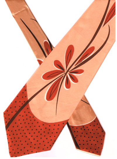
Flower Starburst

This is the other tie most recently added to my collection, purchased from the second-hand store in Seaside back in the last week of November. I had originally planned to post it last week, but then remembered that I had for months been planning to post the wintery tree in honor of the Winter Solstice, instead.

Not to mention that this tie seems especially appropriate for posting on New Year's Eve, as the stylized floral "starburst" pattern, as I'm calling it, does resemble a burst of fireworks, at least a little.

I'm not sure that the scan does the true color of the tie justice, at least not exactly. To my eye, the real color is just a bit more "peachy" and less orange than it appears on the screen.

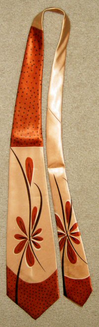
I've posted a second, full length shot, taken with my digital camera, to help you gain the full effect of the tie. You'll notice how the color and pattern abruptly changes to the darker orange with the polka-dots so as to insure that the knot would be tied in that color, contrasting with the rest of the tie.

Beyond that, I can't really think of much to say about the tie. No labels have survived to transcribe. The tie has no brocade woven into the fabric itself, but relies on its warm colors and vibrantly dramatic design for its stunning effect. A very nice tie, indeed! Especially since it only cost me $2.00!

Sunday, December 24, 2006

Winter Solstice

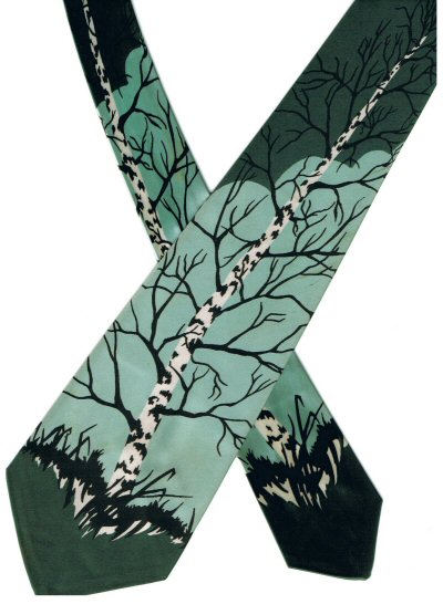
Well, I lied. Last week, that is, when I promised that this week I would post the second of the two recent acquisitions to my collection. But I had forgotten that this week brought us the Winter Solstice, the longest day of the year, and that I had mentally promised myself that I would post this wintery beauty in recognition of that event. So my other new acquisition will have to wait for next week.

I have to confess that I have never understood why the first day of winter is also the shortest day of the year. And that the days will be getting longer from here on out, and the sun will be spending more time in the sky each day, with the weather presumably getting warmer. It seems like the winter solstice should come smack dab in the middle of winter, not at its beginning. Oh well, I'm not the one who makes these kinds of decisions, obviously.

I have seen pictures of this tie elsewhere, but can't recall just where right now. Ah yes, here's one place. Which is a page on Knot, Kollectors of Nasty Old Ties. Anyway, it's definitely a favorite. The tie's one label reads:
Wembley
Reg. U.S. Pat. Off.

Sunday, December 17, 2006

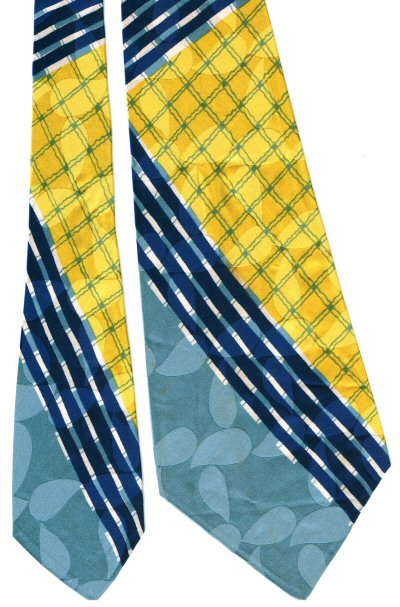
Blue and Yellow "newbie"

This tie, along with another (to go up next week) is the latest addition to my collection. While on the "vacation from hell" a couple of weeks ago (my wife and I both came down with the stomach flu), we managed to visit one junk store--oops, make that a second-hand store (we always refer to them as junk stores) in Seaside, down on the Oregon coast.

This tie, and its companion were tagged at $4.00 each, a real bargain, but not only that, they had pink tags, and all pink tags were half price that day, so I actually only paid $2.00 apiece for them. They're undoubtedly worth much more than that. If the prices at vintage clothing sites such as RustyZipper are any indication, they are easily worth $15-$20 each, possibly more.

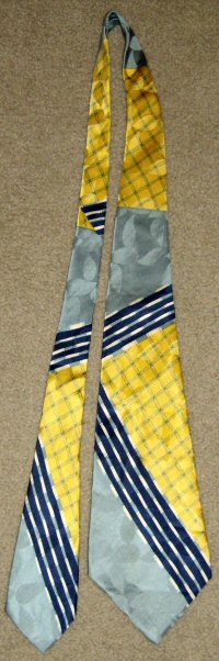
Blue and yellow together aren't my favorite color combination, but it is nevertheless a nicely designed tie, much more interesting than plain old stripes would be. Note the stylized leaf-shape brocade pattern woven into the fabric, or could those perhaps be incipient paisleys? Nah, I don't think so. Most of them aren't twisted enough at the end for paisleys.

I've also loaded a full length image of the tie, so that you can see how the pattern progresses up the tie, and notice the abrupt line where the yellow comes back. As with so many ofther ties I've posted, the knot is intended to be entirely in the yellow color.

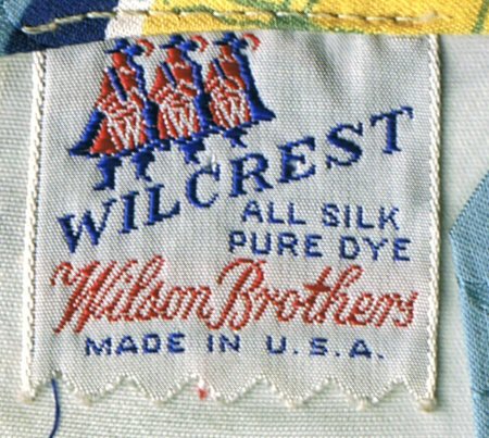
The tie has two labels, both a seller's label and a manufacturer's label. The latter is so interesting that I decided to scan and load a picture of it as well. There are three cockaded and booted gentlemen resembling the Three Musketeers of Alexandre Dumas fame. Each has a capital letter "W" emblazoned on his lower half. An early example of "WWW!" It almost looks like the three are drummers, and that the "W's" are written on the drums, with each fellow rapping out a drum roll, but I can't make out quite enough detail to be sure of just where their arms are placed.

The label reads:
Wilcrest
All Silk
Pure Dye
Wilson Brothers
Made in U.S.A.
The seller's label reads
Desler's
Seaside, Ore.
Based on that label, this tie never made it very far from its original point of sale, as Seaside is where I picked it up, well over half a century after its presumed original date of sale.

A fine addition to my collection! And a lucky find, to boot.

Sunday, December 10, 2006

Blue and Gray, Black and White

Here's another vintage beauty, this time with a color scheme featuring blue, gray, black and white. Still a suitably wintery palette. The swirling, branching patterns woven into the fabric itself are almost more dramatic than the tie's own pattern.

This is another of those ties in which the knot was intended to be tied with its own different but coordinating pattern. I've loaded a separate image of the upper portion of the tie, showing the abrupt break in the pattern where the knot would have been tied.

The tie has one label which reads:
Wembley
Reg. U.S. Pat. Off.

Sunday, December 03, 2006

Navy Blue Op Art (sort of) Design

It's time, regretfully, to move away from all of those wonderful autumn leaves, as winter has definitely arrived, at least here in the great Pacific Northwest. We were on the road, down in the Willamette Valley, west of Portland, where we received several inches of beautiful snow on Monday and Tuesday last week.

While we were away, they had ice and snow here in the Olympia, Washington area. On Monday, initially only five (5!) people managed to make it in to work at the State Library, or so I heard tell when I got back.
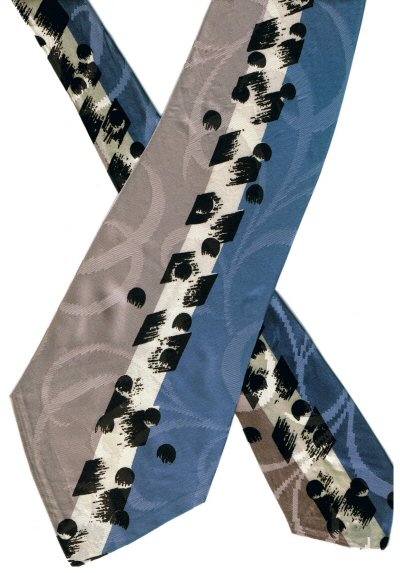
The ice was long gone by the time we returned, but the cold weather lingers. So, here's a tie that seems more appropriate to winter weather, it's pattern perhaps suggesting streaks of rain and wind, if you wish to let your imagination flow in that direction.

The "crop circle" like images you see near the base of the tie, and a few inches higher, are actually the brocade, woven directly into the fabric. As are the slightly curved, more or less horizontal parallel lines you can see nearer the top of the image, some sweeping over the dark triangle, and some just higher up, curving in the opposite direction.

I decided to scan and mount a picture of a portion of the backside of the tie. Interestingly, in this case, the pattern of navy blue lines from the front is not carried over onto the back, which gives a better opportunity for viewing the interesting patterns woven into the fabric.

The tie has a single label, sewn into the small end, which reads:
Haband
Paterson, N.J.

Sunday, November 26, 2006

Purple and hand painted but faded

I quickly loaded this image this past Sunday, but didn't have time then to write any commentary, as my wife and I were leaving on a road trip from which we only just now (Thursday afternoon) returned.

Since then, I came back and loaded a different version of the image, on which I applied less color balancing. I think the painting is slightly easier to see in this version.

This tie is somewhat similar to the much nicer specimen I posted last week, sharing a purple background, and hand painted image featuring leaves. However, the paint has faded over the years, and the image is barely discernible these days.

My best guess is that the leaves are grape leaves, as there appears to be a gnarly old grapevine stem extending below the small leaf at the lower left, and running up into the third leaf from the bottom.

So are the three globes supposed to be grapes? That is possible, I suppose, but they seem large in comparison to the leaves, and grapes usually appear in bunches, not singles. Not to mention that the two barefly visible leaves placed highest on the tie are a different shape altogether than those further down on the tie.

So the intended subject matter remains ambiguous, at least in my view. The tie preserves only a faded remnant of the glory it presumably once had. There is one label, sewed into the large end of the tie which, strangely, is sewed right across the middle of the label, making it difficult to read. I read it as follows:
Towncraft
Exclusive creation
by Rapsons
Rayon
Dry clean only