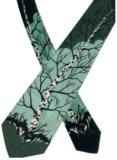
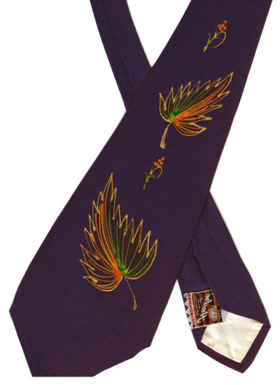
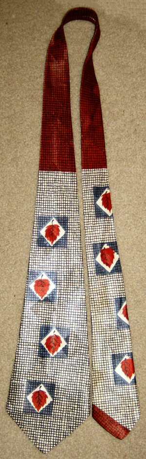
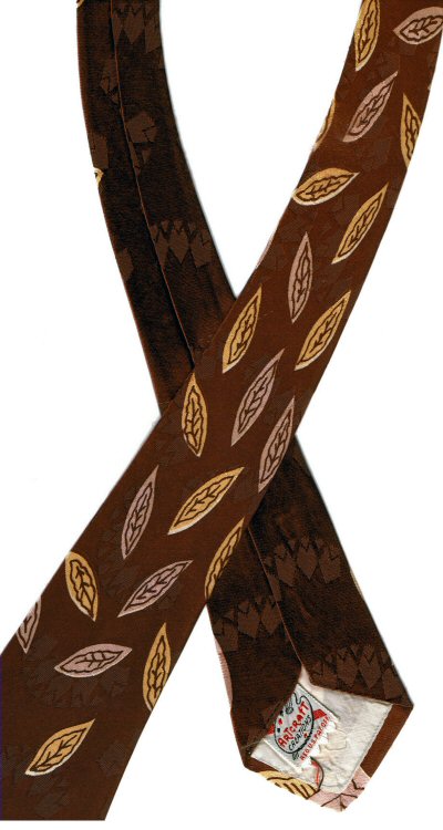
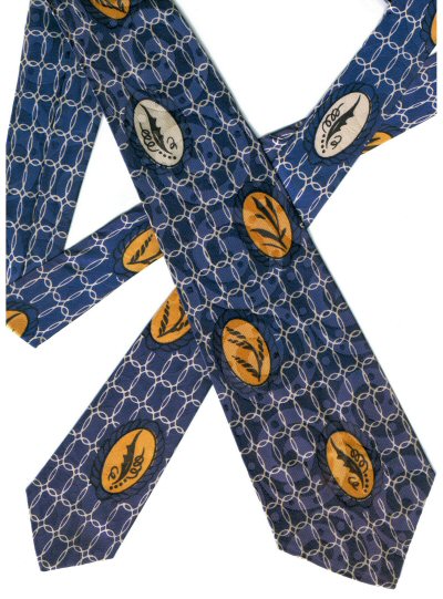
This used to be one of my all time favorite autumn leaf ties, and still would be, if I hadn't ruined it. Accidentally, but even so . . .
I can't even remember what I was trying to do; I might have been preparing a display of my ties, or something, but I was cutting something, maybe a paper background, with the tie on top of it, or very nearby, I just don't recall. Carelessly, I cut about 3/4 of an inch into the tie itself. I've been kicking myself ever since.
You can't really tell in the picture. The cut begins on the left side, just about even with the top of the first dark blue square nearest the bottom of the tie. You can see kind of a little jog in the edge of the tie where the cut begins. You can't see it, but the cut extends almost all the way in to where the dark blue square begins. It stops short about one and a half of those little grid marks short of the dark blue.
VERY ANNOYING! And there doesn't seem to be any easy or safe way to fix it. So I don't wear the tie any more, but I still love the design. That wonderful close-hatched grid of lines across the entire surface of the tie, which appear to be hand drawn--that is, the original design would have been

hand-drawn, I would imagine, not the design on the fabric of each individual tie. (That last is an incomplete sentence, but I don't care.) And of course, the leaves themselves, bright red, close-set inside the white diamond shape to make them stand out, then surrounded by the deep blue square, all together creating a rich and dramatic feeling.
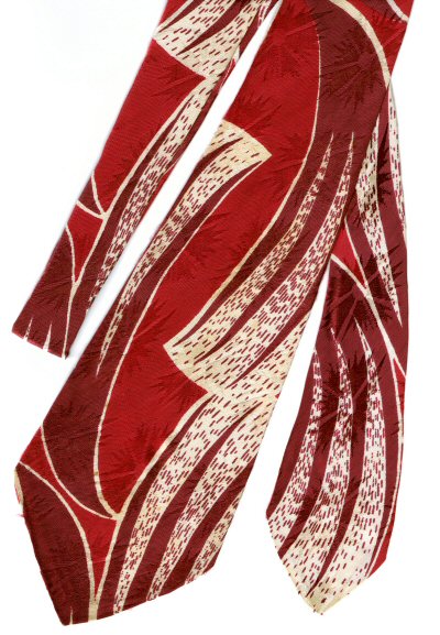
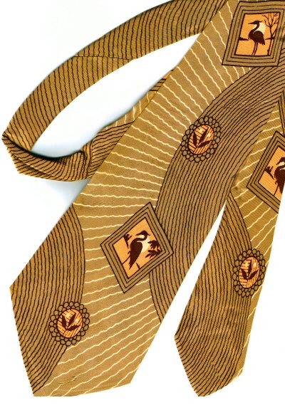
You'll note the solid red portion near the top of the tie in the full length image I shot with my digital camera. This is another of those ties in which the knot appears in a complimentary color. That's the purpose of the solid change in color, to make the knot appear red.
Of course, they wore their ties much shorter back in the forties than we do today. To make this tie long enough to reach my belt buckle, the modern requirement, I have to tie it with the small end really short, and the solid red end extends several inches below the knot. Unfortunate, but that's the way it is. Moot point, since I can't wear the tie any more. But it's still worth showing off here.
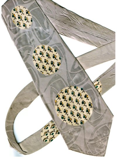
The tie is also one of those high quality models which includes a pattern woven into the fabric itself, what I refer to--rightly or wrongly--as a brocade. It's difficult to see in the pictures here, but it's most visible near the bottom of the short end of the tie, where you can see another diamond shape, almost exactly the same size as the white diamond surrounding the red leaf, but just below it, located between the blue square and the slash of red across the bottom of the tie.
There are four smaller diamond shapes, themselves arranged into a diamond square, in the center of each of these brocade diamonds. In the example I refer to above, you can see them hinted at as slightly darker blobs in the middle of the larger diamond.
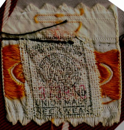
The tie has two labels, both sewn into the back of the large end of the tie. The seller's label reads
CARR'S STORE
Fairbanks, Alaska
while the maker's label states
by HOLLYVOGUE
Made in California
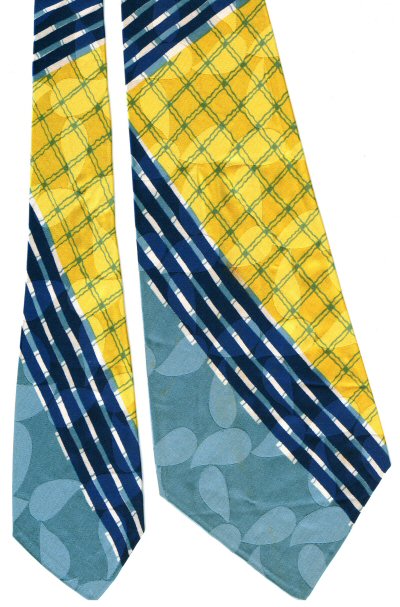
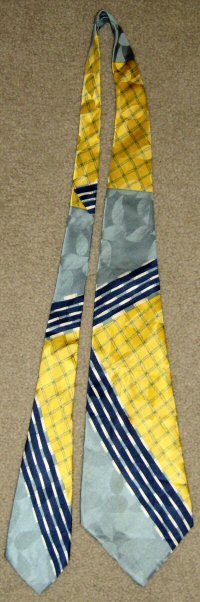
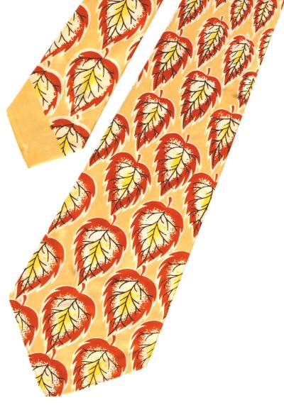
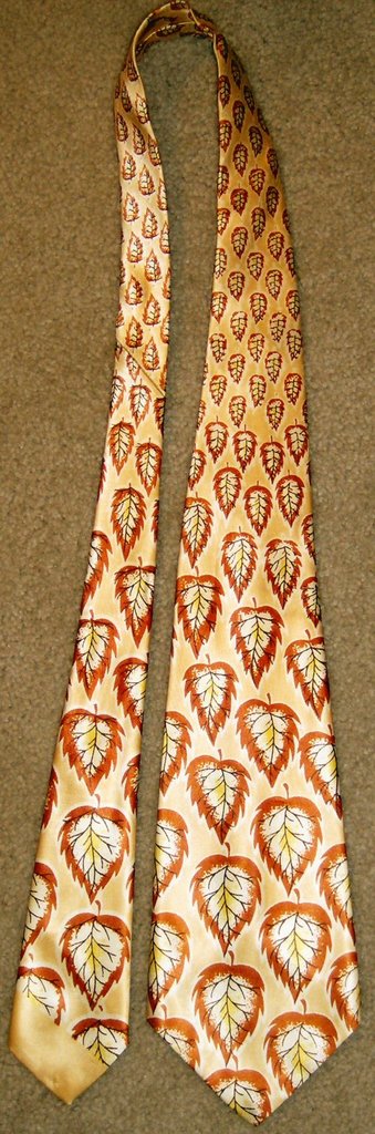
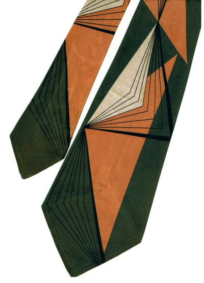
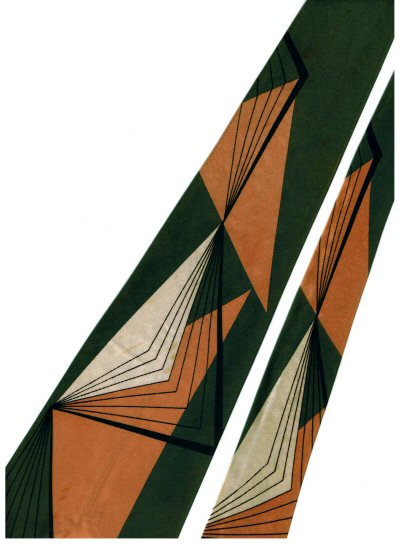
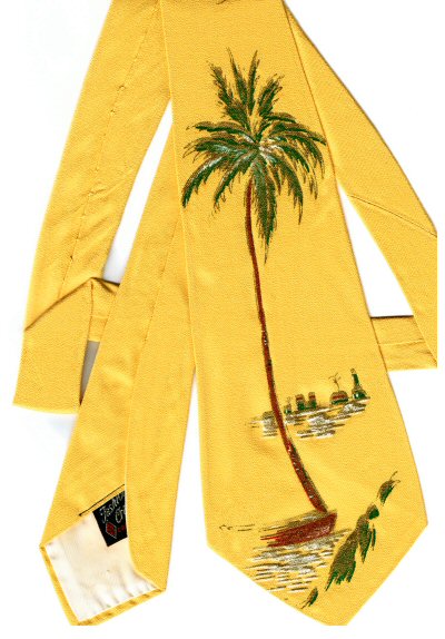
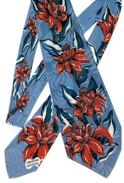
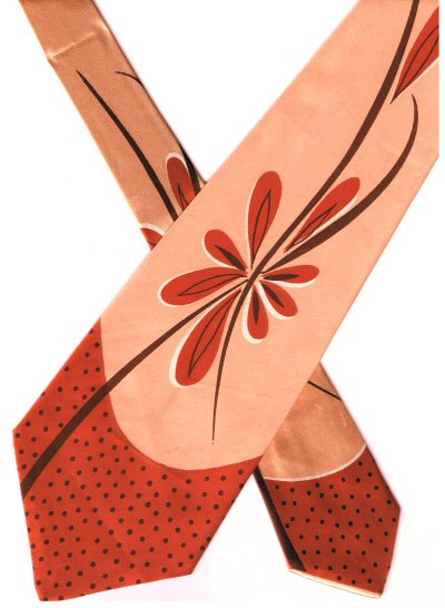 This is the other tie most recently added to my collection, purchased from the second-hand store in Seaside back in the last week of November. I had originally planned to post it last week, but then remembered that I had for months been planning to post the wintery tree in honor of the Winter Solstice, instead.
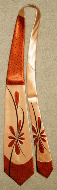 I'm not sure that the scan does the true color of the tie justice, at least not exactly. To my eye, the real color is just a bit more "peachy" and less orange than it appears on the screen.