Sunday, November 08, 2009

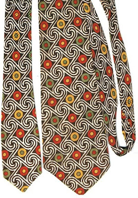
Scrolling Circles

Here's an unusually patterned tie! Scroll-like patterns separate circles with differently colored dots at the center of them. Some of the circles are yellow with green dots, some red with yellow dots, and some green with red dots.

I believe this to be a forties era tie, primarily because of the fabric, which is the smooth, thin, acetate or silk, so typical of that period. The design is almost op art, reminiscent of the sixties and seventies, but sixties ties were thin, not wide, and seventies ties, when they got wide again, were generally made from thick polyester. So I'm relatively confident in my forties identification.

The tie has one label, which oddly, is sewn onto the back of the large end, about eight inches up from the end. It reads:

FASHIONED
AND
HAND MADE BY
Marilyn

The first letter of each word in the label is red, the others black. The word "Marilyn" is in a script style font, the rest in block letters. There is a small image of a woman in a long skirt and apron apparently hand-stitching a tie, to the left of the text on the label. A row of X's and dots surrounds the writing on three sides, with the image of the woman on the fourth side.

Sunday, November 01, 2009

Golden Teardrops

Another recent eBay acquisition, this beauty has a background that is somewhere between burgundy and brown, with golden yellow teardrop shapes splattered about, together with some teardrops that are lighter in color, lined with the background to create a patterned effect.

I wish you could see the brocade in this tie, but it really didn't come through in the scan at all. Parts of it are elaborate leaf and plant shapes, but another part shows a fantastical beast, which looks like a phoenix perhaps, or maybe a bird of paradise, or some other mythical or imaginary creature. The lower half of this bird-like beast devolves into what almost look like more leafish figures. It's quite an amazing image, and hard to make out with the naked eye, let alone in a scan.

There is one label sewed into the small end, which is faded, and difficult to read, but appears to show a small coat of arms, under which it reads:

Exclusive Fabric
Resilient Construction

Sunday, October 25, 2009

Red Paisely (again?)

I know, I know, it's been almost three months since I've posted a tie here. I can hardly believe it myself. I wouldn't blame any of you who monitored this blog for thinking it was dead, or that maybe I was!

No, I'm still here, and I have a bunch of new ties that need to be posted. My wife gave me half a dozen or more great examples for my birthday last month, plus I've scored several great hauls on eBay recently.

So where have I been? Just busy, busy, busy. My life has seemed to overtake me, leaving little or no time for blogging. Getting on Facebook didn't help, as that's a real time sink, no two ways about it. But mostly, there has just been TOO much to do, too many errands, chores, tasks, responsibilities, which have filled up my Sunday afternoons, leaving no time for blogging.

Well, I'm back, and I hope things will slow down for a while, and I'll be able to get back into the swing of blogging ties for a while. So what about this beauty? It's one of the eBay finds I made in the past month or so. As is so often the case, I fear that the scan may not truly do it justice.

While it doesn't have the brocaded pattern woven into the fabric that my favorite forties usually have, it is made from a very shiny, almost brilliant satiny fabric that has a very luxurious and elegant, even opulent feel to it. The stylized paisley pattern is dramatically dispalyed in white and silver, with burgandy trim matching the striking burgundy background.

In the scan, the small end, and the other cross-wise pieces, which were behind the wide end on the scanner bed, appear much darker, brown or even black. Trust me, the wide end is closest to the real color, but the shiny, silky feel of the fabric barely comes through. The tie has one extant label, sewed into the inside of the small end, which reads simply "Brent." And sideways in very small letters "35J-S7".

I'm glad to be back and hope to present several more fabulous finds in the very near future.

Sunday, August 09, 2009

Peacocks on Red

Here is a recent acquisition. It came in another batch of cheap ties on eBay. Sometimes you really do get what you pay for! I have this search set up that only alerts me if a vintage tie listing for $10.00 or less is within 48 hours of expiring, and with no bids. In other words, I'm the inveterate bargain hunter!

The ties that came in this particular batch are nice enough, but in relatively poor condition. This one has some small drops of paint near the bottom, and is generally a bit dingy, showing its age.

It may be fairly old, based on the construction, which is overlapping in back, not centered, as later ties tend to be. Also, there is no lining, just the tie fabric itself, with some stiffening fabric sewn in further up.

The design is pretty straightforward, if just a bit flamboyant. Showy peacocks strut their stuff amid hints of a fancy formal garden. The tie is done in what appears to be just three colors: the deep, almost brick-red, a blue-gray, and yellow, on top of white (one presumes). I say presumes, because I don't really know how the fabric was printed. It appears as though the red is the true background color, and I suppose the white, like the yellow and gray-blue, were printed over it, but somehow I doubt it.

The tie has one label, shown in the scan. I assume it's the seller's label. It reads as follows:
C.E. Pyle
Rochester, Ind.

Sunday, July 26, 2009

Blue Strawberries

Strawberry season is already past, more or less, here in Western Washington, although there should be another season for the late berries. We were on vacation most of that time, as I recall.

Anyway, here's a tie that appears to depict strawberries, even though they're a fairly unusual blue color. And some of them are on top of leaves, although they don't look exactly like strawberry leaves to me.

The background color of the tie is a deep maroon color, sort of a wine color, and unusual shade. In the scan, it probably doesn't come through well. Right now, on my screen, it looks more of a chocolate brown color. The fabric doesn't have any brocade, but has a shiny, silky, sheen to it, like so many ties from that era.

The tie has two labels, shown in the scan. The first one, which I assume to be the retailer's label, reads

Armstrong's
"Quality is economy"
Cedar Rapids

The second label, which I presume to be the manufacturer's label, reads

Cahama
California
Swagger

Sunday, July 19, 2009

Red & Yellow, Silver & White

I know, I know. It's been three weeks since I last posted a vintage tie here. Mea culpa. We were on vacation the first two weeks, and then the next week we were trying to catch up from having been gone so much. There often just aren't enough hours in the day or the week to go around.

But I'm back. And I hope you enjoy this tie. It's a classic forties era design, quite colorful, with a lively design.

I'm not really sure how to describe the design. I'm almost tempted to just refer you to the title I gave this post, and leave it at that. Except that it's probably more maroon than red. Red only in a very general, generic sense.

But to just call it abstract would be a cop-out. If you look carefully, the large maroon blob could be a leaf-like shape, I suppose. It almost looks more like a large toothy saw blade, with the yellow and silver ripper blades around the edges. And lower down on the tie is another smaller version of the same thing.

Instead of a saw blade, it could be some sort of amoeba blob thing, I suppose. I think my imagination may be getting a bit carried away. Let's go back to something tamer, like a highly stylized leaf or flower, maybe a sunflower! or something. Or something else altogether? You decide.

The tie has one label, sewn into the small end which reads as follows:

Ward & Ward INC.
Phila. PA.

Sunday, June 21, 2009

Dad's Mums

In honor of Father's Day, I present this tie, the last of the ties (to be posted here) that belonged to my Dad. When I first became interested in vintage ties, back when I was still in high school, I went to my Dad and asked him if he had any old ties. Sure enough, he had a nice little collection of ties from the forties, some of them quite splendid, indeed.

Unfortunately, some of them were in the old farmhouse when it burned to the ground a year or two later, just before I graduated. But I have the three that survived, and this is the final one to be posted. The two earlier examples are Dad's Red and Blue Paisely and Feathers for Father's Day.

This one is just as attractive as the other two. I'm sorry that I had to scan it with the pointed large end of the tie off the scanner bed, but it was necessary in order to get the entire bouquet of carnations into the picture.

Yes, I know I called this post "Dad's Mums," which would imply crysthanthemums, but these are more likely supposed to be carnations. I just couldn't resist the wordplay supplied by that title!

My Dad's been gone for several years now, and my Mom can't keep up with the old place anymore. So she put it on the market, and now it has sold. This very weekend, she's moving away, to live closer to my one of my sisters. That in itself is difficult to deal with emotionally. My folks moved to that little farm (13 1/2 acres, more or less) when I was only three, going on four years old. That was over fifty years ago! And that's been the place I've thought of as "home" for all these years, the place I've always gone back to. And now it will be in someone else's hands. Kind of a tough way to celebrate Father's Day! But it was inevitable; we knew it was coming, and it's really only a kind of ironic coincidence that it happened on Father's Day.

But back to the tie. It has one extant label, sewn sideways into the short end of the tie, which reads:

Resilient construction
Towncraft Deluxe Cravat
Fabric loomed in U.S.A.

The tie is made of that wonderful shiny, silky, slippery fabric so common to the era, probably rayon. It doesn't have a brocade, but the design itself creates almost the effect of one, with the infinitude of small tine white striped lines that flow down the silvery colored portion of the tie's surface.

At the top end of the scan, you can just barely see where the fabric turns solid red, which would have had the effect of making the knot solid red in color, matching the featured slice of red that splays out across the center of the tie, and the two red carnations, which give the tie its dash of brilliance.

Looking at this tie, holding it in my hand, reminds me once again of my own father, bringing back many memories.

Happy Father's Day to dads everywhere!

Sunday, June 14, 2009

Purple with Orange Birds

Last week's post featured pheasants in the brocade. This tie unfortunately has no brocade, but it also features birds, this time right on the tie, not hidden in the background.

What kind of birds they are, I'm not exactly sure, not being an expert birder or anything. But they look like fairly common ordinary type birds. At first glance, I thought they might be swallows, and the wing positions suggest swallows swooping, but the birds are a bit too plump to be swallows. They may not be realistic attempts to portray any particular species of bird, but may just be generic birds, who knows.

This is a gorgeous tie, with its combination of purple and orange, and with the background of branches, over which the birds are swooping and fluttering, indicate by the swirling movement lines connecting them. It and last week's "Pleasant Pheasant Brocade" exemplar came together in the same eBay purchase, the two of them sold as one lot.

There are two extant labels on this tie, sewn into the large end of the tie, rather than the small end, as is more typical. The first label is the seller's label, and it reads:

Goldstein-Migel Co
Waco, Texas

The second label is the manufacturer's label, and it reads:

California Classics
Hollyvogue
Made in California

As such, it joins four other Hollyvogue tie postings on the blog:
The last of those posts talks a bit about the Hollyvogue brand, and provides a link to the current Hollyvogue web site.

Sunday, June 07, 2009

Pleasant Pheasant Brocade

Now here's an interesting tie. Also a relatively recent eBay acquisition. On the surface, what you see is a kind of shimmering stripes of orangey brown and tan, fading into one another, and angled from left to right at about a 45 degree angle.

Right about midway up the tie (it looks higher on the scan, due to the limited range of the scanner, which can only handle 8 1/2 by 11 inch images), is a patterned stripe containing a vaguely floral pattern that could almost be Christmas inspired, with leaves of red and green formed into large draped garlands.

But by far more interesting than any of these details is the pattern woven into the brocade, which consists of what appear to me like stylized pheasants, or fancy long-tailed birds of some type. I suppose a more fanciful view might be that they are representations of the fabled Phoenix bird.

I suspected they would be difficult to see in the scan of the tie itself, so I selected one bird out, and saved it as a separate file, enhanced the color and contrast a bit to make it hopefully easier to see, and frankly, to make it slightly closer to the original, at least in my eyes. Of course, I realize that this is very subjective, since I have no way of calibrating my computer monitor accurately, so I don't know if the colors I'm seeing are even close to what you, gentle reader, may see on YOUR screen.

But hopefully the bird, at least, is more clearly visible in this closeup view. So that you can make up your own mind what kind of fowl it represents. These birds literally cover the entire surface of the tie, since they are woven directly into the fabric of it, even under the stripe of darker brown, red and green swags.

The tie has but one label, which is printed directly onto the fabric just a couple or three inches from the bottom of the large end, on the back side. If I hadn't already loaded two separate images, I would have been tempted to scan the label and show it too, but I didn't want to take the time, having some chores yet to do today. The label reads as follows:

Van Heusen
Original

So there you have it!

Sunday, May 31, 2009

Brown & Tan Clouds

Here's another recent eBay acquisition. It's a nice example of forties color, style and design. It's not quite in the first rank so far as opulence goes, without any background brocade pattern woven into the fabric, but the fabric itself is shiny and glossy, as typical of so many forties ties.

The tie seems to depict a brown sky full of stylized brown and tan clouds. The entire tie has an orangy cast to it, one of the favorite color schemes of that era. Back in January I posted links to several ties utilizing this general range of color. Not to mention the "Orange and Brown Rosettes" from a couple of postings ago.

This specimen has two labels extant:

Resilient Construction
Towncraft Deluxe Cravats
Fabric loomed in U.S.A.

reads the first one. The second simply says

Fidelity Cravats.

Both labels are shown in the scan. Well, that's it for this week. Chores are calling (like gathering up and taking out the trash) and we still have to go on our walk.

Monday, May 25, 2009

A Green Dream

Isn't this a a gorgeous beaut of a tie! I call it "A Green Dream." It's maybe a bit TOO flamboyant, but I like it a lot. I have to tell you its story (the limited part I know):

I found this tie languishing in a junk store--oops, make that a second-hand store, located right next to the discount mall in Seaside, Oregon. It's a favorite place for us to stop and poke around whenever we're passing through Seaside, which is not too often these days.

I say "languishing," because the tie was almost completely disassembled when we found it. It was completely unsewn in back, all the stitching that holds it together had come undone. Consequently, we didn't have to pay much for it, 99 cents, or less, as I recall.

When we got back home, we took it to the dry cleaner, where a seamstress also plies her trade, but she refused to have anything to do with sewing it back up. Too tricky for her, I guess, although she didn't give a reason, just said no.

So Arline (that's my wife for anyone who doesn't already know), sewed it up herself, carefully stitching it up by hand, a process that took her a couple hours of painstaking work all total. In addition to the stitching, she had to carefully iron it, removing the wrinkles that were imbedded, from its having not been in the correct shape, or form for quite some time before we acquired it. That was truly a labor of love on her part! Thanks, my dear!

The tie itself is quite spectacularly over the top. It's a deep glossy green, with three downward pointing triangle shapes near the bottom, with a large pointed spear of fluorescent yellow-green stabbing down toward the center of the tie. I now realize I'm going to have to scan and post another shot of the tie further up from the bottom, to show what happens there. My scanner just isn't big enough to do it justice all in one scan. I really do need a larger scanner bed.

As you can see in the second scan, the three triangle shapes are repeated further up the tie. I'm also posting the label, which is embedded directly into the fabric and design of the tie itself. It reads as follows (although I'm sure most of you can read it for yourself):

Cutter Cravat
Artist Original ©

In addition to its striking design and colors, the tie has a large scale brocade woven into the fabric, giving it yet another aspect of opulence. The brocade consists viny curlicue patterned shapes, somewhat reminiscent of the classic paisley design.

Well, that's more than enough said about this tie. Hope you enjoy it!
Sunday, May 10, 2009

Orange and Brown Rosettes

Here is another very nice forties vintage tie, which came from another eBay purchase. In this case, two ties were bought in a batch. I don't recall the price, and am too busy (or lazy) to look it up just now, but I am fairly sure it was more than I paid for the last four.

The basic pattern revolves around some vaguely floral patterns that I'm calling rosettes for lack of a better term. It's interesting that the brown dots make up the filler for the rosette shapes, but similar sets of orange/tan dots are just splotched onto the tie as kind of shadows to the darker ones, outside the rosette shapes, slightly above and to the left of each one.

The rest of the tie's design consists of concentric lines drawn around the floral rosette shapes, in ever widening circles, like the ripples around a stone thrown into a pool of water. It reminds me of one of my favorite doodles when I was younger. I'd start by drawing a few randomly placed circles, squares, triangles, etc. on the page, and then begin drawing concentric lines around each one, until eventually they began to merge with one another, and the whole page would be filled with concentric designs, much like this tie.

The tie also has a brocade in the fabric, probably not very visible in the scan, except as a kind of shadowing here and there. The brocade pattern consists of paired straight ribbon like lines, about a quarter of an inch apart, moving toward and away from each other in a sort of diamond shaped pattern. Actually, you can see them on the orange part of the tie. This tie, like quite a few from the period, switches to a solid color (orange in this case) partway up the tie, so that the knot would be entirely in that complementary color.

There are no labels on the tie, so that's about it for now. See ya next week!

Sunday, May 03, 2009

Grapes and Flowers

I guess those are grapes. Not sure what else they could be. However, the flowers are more grape colored than the grapes themselves, which are more of a silver gray color than seems natural. Oh well, at least the leaves are green. And the flowers ARE a fairly spectacular shade of blue. Blue IS my favorite color, after all.

This is the last of the four ties I got on eBay a few weeks back, for $2.00 plus $4.00 shipping. Quite a bargain, I think. Since then, I've bought several more batches of ties the same way, albeit for a bit more money, most of which will undoubtedly end up here on this blog eventually.

This beauty is fully 4 1/2 inches across at its widest point. No extant labels to transcribe, unfortunately. I love that word, "extant," don't you? Here's one definition I found:

Still in existence; Currently existing; not having disappeared.

Did you know that one of the easiest ways to get a quick word definition is via Google? Just put "define:word" (without the quotes, natch) into a Google search box (note: no space between the colon and the word to be defined). And Google will display any definitions it has found on the web. Very handy, and if not ALWAYS 100% accurate, it's pretty close.

Well, I see I've wandered well off topic, which means it's probably time to close this blog entry. I mean, what can one really say about a tie like this that the image of the tie itself hasn't already said better? This is one of those cases where a picture is definitely better than words. Of course that never stopped me from blathering on. It's one of my specialties. Until next time, then . . .

Sunday, April 26, 2009

Basic Blue -- Backside View

This tie is SO ordinary, so plain, so basic blue, that I decided to show you the backside, rather than the front, in order to demonstrate a point about the construction of some older ties.

The tie is made of wool, virgin wool, to be sure, but wool all the same. It has no pattern, no design, nothing hand painted or otherwise imprinted on it. Certainly no brocade woven into the fabric of the fabric (ha!). So why even bother to scan and post it?

Because it is indubitably old. The construction alone, says so. Note how it is unevenly folded over in back, with one side wide, the other narrow. This occurs on both the wide and narrow ends of the ties. This type of construction is typical of 1930's era ties, which are almost ALWAYS constructed that way, and some early 1040's ties, as well. But by later into the 40's, most ties were constructed with a more evenly divided fold in back, although many 40's ties still had a slight overlap, one side over the other.

Another clue to this tie's age is the lack of any type of lining. Most later ties had a lining of some sort inside, for stiffening, if nothing else.

The label reads as follows:
Fortmann's
Charmeen
by
Superba
100% Virgin Wool,
The tie is in great shape, given its age, and makes a fine example of simplicity in form and function.

Sunday, April 12, 2009

Red Sections on White

Easter is past, from the standpoint of a church musician. All of those extra services (Maundy Thursday, Good Friday) and Holy Week recitals (two of those), choir rehearsals, extra anthems (3 for Easter Sunday), and all the extra practicing that went along with it. All done and over with for another year. Phew!

So I managed to find time to scan and blog a tie this afternoon. Last week? Not a chance!

Continuing the color theme from the past two ties posted, we go with another stunning red exemplar. This is another of the ties purchased on eBay. I actually got this tie, and the last red one posted along with two other ties, all for $2.00 plus $4.00 for shipping. Which goes to show that bargains can be had, if one shops carefully and consistently.

Admittedly, all four ties are in less than perfect condition. Mainly, they've lost most of their resiliency, and are somewhat limp. But look at the design of this beauty! Look at the color! Look at the pattern! It all comes together to make a truly stunning design.

The fabric is lovely, with a great brocade pattern woven into it, which is probably most visible in the short end, and perhaps on the narrow piece to the right, as well. Click the image to bring up a larger version in your browser, to see it better. The brocade pattern consists of small roughly rectangular shapes, spaced in even rows and columns across the tie.

The tie has no extant labels to transcribe. Enjoy!

Sunday, March 29, 2009

Irididescent Red

Where does the time go? Last Sunday again found me without enough time in the day to scan and post a tie. And I'm almost there today. Just barely squeezing this in between chores and tonight's Masterpiece showing of the first episode of Little Dorrit.

Here is an unusual--but spectacular in its own way--tie! Just plain red, right? Wrong! There is no printed or painted design or image on the tie. Just brilliant iridescent red, with a maze-like brocade pattern imbedded in the fabric enhancing the shimmer.

This tie, like last week's, is one of a group of recent acquisitions, purchased ubiquitously on eBay. I bought two batches of ties there not too long ago, for quite reasonable prices. You just have to watch, and bid carefully, and you can get some real bargains there. I don't have time to look up exactly what I paid just now, but in each case I got 2-4 ties in a batch, and paid less than $20 for each lot. A trip to the dry cleaners adds a little more expense, but cleans up the ties, and voila!

The tie has two labels sewn into the small end, and shown in the scan. The manufacturer's label reads "Hand tailored Smilock." The seller's label reads "J.C. Penney Co. Sioux City, Iowa."

Sunday, March 15, 2009

Red & Brown Geometrics

This tie's color scheme reminds me of the one I posted for Valentine's Day a couple of postings ago. That one was red and burgundy, while this one is red and brown, but they create a similar effect, especially since both have contrasting lighter sections. This one has squares filled with smaller squares, which sort of resemble windows on a building, such as on the side of a skyscraper. The one from two postings ago has sort of overlapping tile or shingle shapes.

And while all of the shapes on the previous one were straight edged, this one contrasts large red circles with the large squares, in a geometrically pleasing design.

I can't believe what BS I've just been writing! You'd think I was trying to craft one of those essay test questions back in high school or something. Oh well, that's what this blog is about, I guess.

Both of this tie's original labels survive. The seller's label reads "Erbes Clothing Mendota, ILL" while the manufacturer's label reads "Phantom Prints by Carholm."

So why was no tie posted last week, or the week before? Well, last week is a conundrum. There isn't any really excruciatingly execrable or extracorporeal extraneous excuse extraordinaire exactly, except that of trying to string together a string of words all beginning with the letters "ex." The weekend before, we were attending our annual family beach weekend, down in Oceanside, Oregon, and didn't get back until too late on Sunday for blogging. Too many other chores to run. As to last week, well, I don't know, events just seemed to overtake me.

Well, this has to be one of the most ridiculous blog entries ever. Hope you enjoy the tie, at least!

Sunday, February 22, 2009

Pink and White Buttons--Gray Stripes

This tie looks nicer in the scan than it does in real life, I think. It's my opinion that this was probably a pretty inexpensive tie in its day, and it's probably lucky that it survived this long.

Why do I think it was a cheap tie? Mainly because the fabric is not high quality, no brocade, not even a rich sheen or shine like many of the silk or rayon ties typically have. The fabric has also lost any resiliency it may have once had, and is fairly limp. And the imagery on the tie seems a little crude in its execution, cheaply printed on cheap fabric, is the impression I get.

I also suspect that someone refolded the end of the tie at some point to make it narrower. Most ties of the period have more of a flaring out as the tie nears the end, while this one seems to be of an equal width for much of its length. And believe me, there's plenty of fabric folded over in back to make the end wider. It would definitely be a more dramatic tie, if it were wider as it approached the end.

So now that I'm through dissing the tie, let's talk about what is nice about it. The color scheme is pleasing to the eye. And there is nothing wrong with the design itself, vertical black stripes on a gray background, with pink and white buttons in a row up the center, and grouped in a circle further up the tie.

So, while it may not be one of my favorite vintage ties, it is in my collection, and I present it to you today, for better or for worse. The tie has one label, interestingly sewed onto the fabric on the back of the wide end, rather than the narrow end, as is more frequently the case. The label has only one word: Wembley, together with the "registered" R in a circle emblem. Which makes me wonder just how old this tie is. When did the R in a circle first come into use?

Sunday, February 15, 2009

A Little Red for Valentine's Day

This is the best I could do for Valentine's Day this year. I only own one vintage tie that relates to this occasion, and I posted it already last year, so you'll have to go back and revisit it, if you want to see a vintage tie with hearts.

So this year, I just hunted over my rack of red ties until I found one that I hadn't already posted, which was difficult, as there are only a few left unscanned and unheralded here on the blog.

I can't say as this tie fits the theme of Valentine's Day very well, but at least the big red block in the center of the tie has a pointed end, like an arrow. Of course, one COULD say that it is a pointed end, like the end of the tie itself. And one could point out that there is another block, gray in color, pointing right back at the red one.

The geometric aspects of this design are actually more reminiscent, in my view, of a tie I posted back in July of 2007, aptly titled "Orange Geometrics." Had I not been stretching things to make a barely justified connection to Valentine's Day, I might have called this tie "Red, Burgundy, and Gray Geometrics."

The tie has no surviving labels, and shows its age with some staining. No brocaded fabric, either, which makes me think it might have been less expensive than some. But the design is very nice, quite striking in its own right. A very nice tie, whether or not it fits the season.

Sunday, February 08, 2009

Bright as a New Penny

The name of this design, printed on the small end of the tie, tells you what it's all about. "Bright as a New Penny," it reads. So the bright yellow coin-shaped circles are obviously intended to represent the bright and shiny new penny, with the other circular objects looking like less shiny pennies, or just spin-offs from the original bright and shiny one.

Meanwhile, similarly gold-colored lines criss-cross the tie, dividing it into diamond-shaped quadrants. A rich shade of blue provides an appropriate background against which the rich gold colors stand out strikingly.

There you have it. There's not much more that needs to be said about this tie. It has no labels, other than the printed on name of the design. A previous owner seems to have inked his name onto the lining of the small end. "Loewe," it reads. The "L" has a long tail that extends horizontally under the other letters.

I suppose it could be a manufacturer or store label, but it appears hand-written. There is a frayed hole in the label just above that area, which could be where a label was ripped out from having been sewn onto the tie, as they generally are.

This tie shows its age a bit, in that the blue background appears darker in some areas, and may be stained in places. The fabric is less expensive than that of many of my ties from this era, in that there is no brocade, and it has a more matte surface, rather than the shinier, glossy look of what I assume were the more expensive ties. It just looks like a cheaper tie to me. Still, it's nice enough, and the design title, telling us what the designer had in mind, is a nice touch.

Sunday, February 01, 2009

Maroon Thingamajigs

This tie reminds me of all my maroon 30's era tie blog entries I linked to back in July of last year. It has a similar color scheme, although I suppose it's a bit wider than most of those, at precisely 4 inches at its widest point.

Further, it lacks other characteristics of those 30's era ties: it does not have lopsided construction on the back side, it is lined (most 30's ties I own aren't) and the design on the tie is not woven directly into the fabric (as most 30's designs are). So, I would have to say that this is more typical of 40's era ties, but that the color scheme is very reminiscent of 30's.

The rich maroon background color is enhanced with a delightful brocade pattern, somewhat unusual, consisting of many dots, formed into larger circular patterns. You can see them fairly well in the scan.

The surface pattern, in pale gray or silver, lined with bluish-gray curving lines, is hard to describe. What are these devices? Unable to come up with an accurate description, I've chosen to cop out and just call them "thingamajigs."

The Wiktionary defines "thingamajig" as "something that one does not know the name of" while Wikipedia cites the term as an example of a "placeholder name," defined as "words that can refer to objects or people whose names are either irrelevant or unknown in the context in which it is being discussed. 'Whatchamacallit' (for objects) and 'Whatshisname' or 'Whatshername' (for men and women, respectively) are defining examples." There, I bet you didn't even know that there was a designated term (placeholder names) for words like that.

OK, enough about that. This tie has two labels sewn into the small end, and visible in the scan. The seller's label reads:

Blumenthal's
El Paso, Texas

while the second, presumably manufacturer's label reads:

Superba
Cravats

Sunday, January 25, 2009

Sailing, Sailing . . .

Here's another nice tie in shades of brown and orange, which seems to be a favorite color combination for tie designers in the 40's and 50's. I have an entire tie rack devoted to this general color combination and hue. For a few more ties in this general color scheme, see some of the following links:

Well, that's plenty to make my point. Some are more orange than this one, which is a bit more on the brown side.

The designs on the tie remind me of the sails on sailboats, although there are no boats, no hulls, under the sails. So maybe they weren't intended to resemble sails, maybe they're just abstract triangular shapes.

The tie also has one of those nice brocade patterns that I'm so fond of, woven into the fabric. You can see them fairly clearly in the scan, although as is often the case, they are probably clearer in the small end scan than in the large end. The brocade patterns consists of diamond shaped blocks in patterns of four, and more rectangular shapes in pairs, which form or fill a similar sized square.

Unfortunately, the tie has no labels surviving.

Sunday, January 18, 2009

Brown with Yellow Ribbons

I don't think these are supposed to be the yellow ribbons tied "round the old oak tree," as it says in the song. These look more like ticker-tape ribbons, or maybe old film unwinding. Who knows? They don't look exactly like any of the above, but are suggestive or reminiscent of all of them.

This is an attractive forties tie, good quality fabric that has a nice brocade pattern woven into it. It will probably be difficult to make out the brocade pattern in the scan, as it often is, but the pattern consists of many parallel lines running diagonally across the tie at ninety degree angles to one another, creating, as they cross one another, an intricate almost braided appearance.

The tie has one label, sewn into the small end, which reads simply

Arrow
Made in U.S.A.

The "Made in U.S.A." part has an arrow entering at the left end of the words, with the point exiting at the right. Arrow, is, of course, one of the classic American brands in men's wear, and with a history that goes back over 150 years, apparently. Not that I know all that much about it. The Arrow brand currently appears to be owned by the Phillips-Van Heusen Corporation.

Sunday, January 11, 2009

Orange Florals Kick off a New Year

FINALLY! I'm back, with another vintage tie. I do apologize for the two months' worth of absence, but things have been very busy. I'm not sure I really have time today, either, but I'm making time, since I really want to get back to posting ties, and writing at least a little bit about them.

This is a nice one. Pastel orange background, with splashes of lavender (pale purple, if you prefer) and brick red with off white garnishing. (By which I mean that each splash of color has an off-white shadow, or parallel splash next to it.)

The entire tie is covered with what look like hand-drawn leaf and floral patterns, drawn in a rich brown color.

The fabric has a rich brocade woven into it, which will probably be difficult to see in the scan, but which consists of plump leaf shapes. They are much more visible on the reverse side of the tie, where there are no drawn lines. If I had more time (none to spare this evening, unfortunately), I would have considered making a scan of the back of the tie and loading it as well.

The tie has one label, which is visible on the small end of the tie in the scan. It reads:
ESQUIRE
Cravat
Resilient Construction

and depicts a "coach and four," which is to say, a an old fashioned stage coach, pulled by four horses, with a driver on top, and several other figures, one of which, at the rear, appears to be blowing a horn, announcing their arrival.

I hope to see you again next week, with another tie. In the meantime, enjoy!