Sunday, May 28, 2006

Elongated Ovals

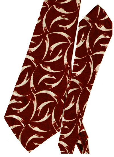
Browns, rust, orange, these seem to be popular tie colors for 40's era ties. This one is a basic brown, albeit with warm overtones, featuring yellow highlights. The little cross hatched lines in groups of three add interest through their business, as do the tiny ovals found in the fabric pattern itself, in larger patches of dark on light, and light on dark. Only the dark on light spots show up well in the scanned image.

This tie has an interesting label which reads:
Hollyvogue
Resilient
Made in California
"Hollyvogue" is certainly an unusual brand name, but as a quick Google search showed, the name is still in use today. In fact there is a HollyVogue.com web site, which states that
We are a family business that has over 40 years combined experience in the fashion industry including designing and manufacturing in both wholesale and retail markets. Our products are manufactured domestically as well as in Europe and Asia. Our family company name was Hollyvogue and we have now carried that name forward to our web site. We take pride in the quality of all our products as we have since the company's inception.
You can see the current line of HollyVogue neckties online.

I also located a site called Jabot's "HollyVogue" Vintage Boutique which boasts that it
is devoted to bringing you the finest quality authentic vintage fashions on the Internet. Shopped by some of the Finest Swing Bands in the Country! Our inventory ranges from the Victorian era all the way through the 1960s for men and women. Dry Cleaned and ready to wear!
Here's a link to their men's ties page.

Sunday, May 21, 2006

White Crysknives on Red

This tie makes a bold statement with its pattern of white on a deep red or maroon color.

Unfortunately, the equally rich brocade pattern is not visible in the scan. You have to look really closely at the tie itself to make it out. Unless the light hits it just right, the brocade pattern is invisible on the tie itself at a distance of more than a few inches.

The brocade pattern is very similar, though not identical, to the shape of the white crysknife patterns that cover the tie itself. The use of the term "crysknives" is a reference to Frank Herbert's famous science fiction novel, Dune, in which the "natives" fashion knives from the teeth of the giant sandwords that inhabit their planet. That is what the white patterns reminded me of, and I couldn't think of anything better to call them.

The tie has a label sewn into the narrow end that reads, simply:
ARROW
MADE IN U.S.A.

Sunday, May 14, 2006

Tropical Bird Plumage

So far I've put up ties with floral images, one tie depicting a fish, one with lanterns, and just last week, a tie that shows a folk scene from the Mexican countryside. But the majority of the ties have featured designs of a more abstract nature. Even the floral
images have been more decorative than realistic.

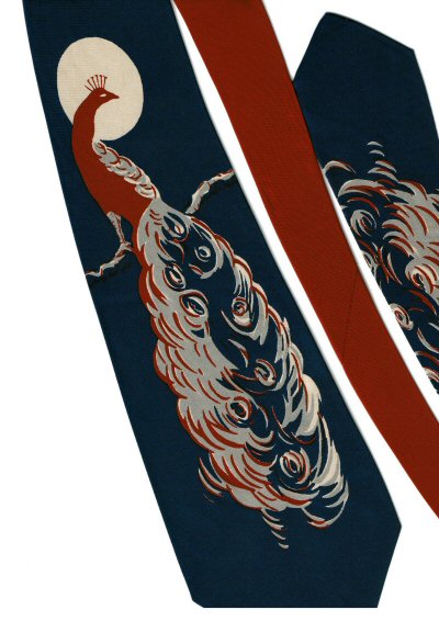
But continuing the theme from last week, if the theme be depictions of things that exist in the real world as opposed to abstractions, I present this fanciful peacock, illuminated by the glorious light of the moon.

One could debate, I suppose, over last week's image. Is that too, the moon floating overhead? Or is it the evening sun, sinking into the west? Whatever the case there, this is surely intended to be the moon here.

In order to display the picture in its entirety, I had to cut off the pointed tip of the tie, something I would ordinarily avoid. But I think it was justified here, as not showing the full image in all its splendor would certainly detract from the effect.

Notice that the small middle part of the tie is red, rather than navy, such that the knot would appear red, complementing the reds in the body of the bird, and the red feather highlights.

Inside the large end of the tie is the seller's label which reads:
J.S. Williams
San Jose
Calif.
Inside the small end we find the maker's tag which reads:
Tropical Bird Plumage
Cheney Cravats
All silk

Sunday, May 07, 2006

Burro, Sombrero, and Hay Wagon

Friday was, of course, Cinco de Mayo, which is NOT Mexican Independance Day, but celebrates a great victory over invading French forces in 1862. That this is a holiday worth celebrating in the United States is due to the fact that the French were supporting the Confederacy, and the outcome of the Civil War could have been different, had the French won in Mexico.

Anyway, in looking for a vintage tie to post today, I thought of Cinco de Mayo, and tried to find something to celebrate all things Mexican. The best I could do was this charming folk image of the plucky burro, pulling the hay wagon, on which reclines the sombrero-wearing farmer, taking his justified rest from the labor of loading all that hay.

In the 40's, as now, tie makers often manufactured the same tie design in several different fabric colors, as shown here. For collectors, finding more than one of the colors is rare indeed, all these many years later. Here three colors are demonstrated, although I had to use the narrow end of one of the ties, in order to fit all three onto my scanner.

How did I come to find all three? They were part of an estate, where the gentleman who had owned them obviously liked the tie, and undoubtedly purchased all three at once. I found them at a vintage clothing store at Pike Place Market in Seattle, in 1991, the year we traveled back from Texas to attend our 20-year high school reunions, Arline at Auburn Academy, and me at Laurelwood. Somewhere in there, we found time to visit Pike Place Market, and I snapped up these ties, along with several others. There is another set of three matching like these, which I will post at a later time, and tell the rest of the story about the original owner of the ties.

None of the ties has a label in it. They must have been popular with their original owner, because they show some staining and signs of wear.

Enough for now. I'll just say "¡Viva Mexico!" and let it go at that.

Sunday, April 30, 2006

Orange with Nonconcentric Green & White Circles

Now for something completely different, try out this specimen! Looks like it belongs on a circus clown's outfit, almost. Some of my friends have told me the spots look like martini olives, but since I'm a fan of tongue twisters, I like to call it my "spilt split pea soup" tie.

This tie belongs to a large class of vintage 40's era ties that were probably less expensive than the elaborately brocaded fabrics I began with on this blog. They are made of rayon, not silk, but costly or not, the bright colors and bold patterns are certainly a reflection of their times, and of the styles of that period.

I used to have a checked shirt (almost a plaid, but narrow stripes) in orange and green that I would wear with this tie when I was feeling particularly daring. I probably looked like a clown when I did! Nowadays it still makes a gaudy statement when I wear it with a solid olive green shirt, or occasionally with an orange shirt I own.

I've had this tie for many years, since the early 80's at least, possibly longer. It may be one I picked up in my college years, I just don't recall. But my earliest recollections of wearing it are in the several years prior to our move to Texas in 1984. So I know I've had it since then, at least.

The label reads:

Pilgrim
Reg. U.S. Pat. Off.
Rayon Cravats

Sunday, April 23, 2006

Spring Blossoms

Now that spring has sprung and Easter has come and gone (although the liturgical season of Easter continues through the 40 days until Pentecost), I thought I should present a tie that befits the season. Strangely, while my collection includes a dozen or more ties featuring autumn leaves, I have precious few that depict spring themes. Here's one, anyhow.

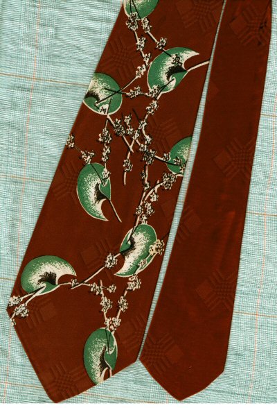
This tie's pattern looks like it has a Japanese influence, perhaps. Spindly branches sport blossom clusters reminiscent of cherry blossoms. What ARE those large green tear-shaped objects? Ginko leaves, suggested my wife. Sounds good to me, I said.

Just for variety, I scanned this tie against a background of fabric from the shirt I generally wear it with. I wore this shirt and tie combination to church 3 times this weekend. Saturday morning at the Seventh-day Adventist church to hear the elite choir from my alma mater present the program in lieu of a sermon, Saturday afternoon at a memorial service for which I served as organist, and again this morning (Sunday) at the Episcopal church where I serve as the paid organist.

I hope you enjoy it as much as I did!

Sunday, April 16, 2006

Gray with Rosebuds

This is the fourth and last, for now, of ties in this swirled matte brushed finish style which I've been featuring for the past month. I own at least one more tie in this style, probably the most spectacular of all, but am saving it for later, not to mention that it is currently mounted in a shadow box display, and I'll have to take it out to scan it.

This is the narrowest one yet, measuring only 3 inches across. I suppose this could mean that it is from a transitional period between the wide flamboyant 40's era and the ultra-narrow, more conservative 50's ties, but to be honest, I don't really know.

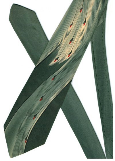
So what are the ten little red blobs which travel down the tie? They could be long-stemmed rosebuds, each with a pair of leaves just below the bud. You decide.

If you look closely (or download the image file and load it into image manipulating software so as to be able to zoom in on it) you can see extra stitching on the thin piece to the right, reinforcing the area which receives the most stress from being tied. This is a feature not found on most of my vintage ties, indicating a higher quality construction, perhaps.

The tie's one label reads: "BY d'Arsac PARK AVENUE NEW YORK", except that the "d'Arsac" is in a much larger display script font than the rest of the text, which is in a common block style.

Sunday, April 09, 2006

Blue "crepe" ?

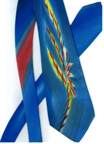
This is the next in the series of brushed surface style ties, this one in a bright blue with red and yellow highlights. My only complaint is that this specimen is not quite as wide as my favorites, measuring only 3 & 5/8 inches at its widest point.

I discovered (from examining vintage ties up for sale on eBay) that sometimes the fabric for ties of this style is described as crepe. I'm not 100% sure that the fabric of THIS tie (or the last two I've posted) should properly be described as crepe, but I just offer this as an observation.

Another thing worth noting is that if you tie it just right, theoretically, the knot will include the red striped section shown here on the narrow piece to the left. This is a common technique for these vintage ties, to change the fabric color so as to make the knot a different color than the rest of the tie, or to complement the primary color scheme in some way. Here the red of the knot would reflect the red highlights down the center of the tie, creating an interesting effect.

This particular tie is beautifully lined with an off-white satin finish fabric that has an elaborate floral pattern brocaded into it. Just inside the back, plainly visible if you turn over the large end of the tie, is printed

"Individually Hand Painted Pure Silk Made in California"

A label sewed to the inside of the small end reads:

"made and styled in california for Penney's."

Sunday, April 02, 2006

Orange Lanterns

This is the second in my series of matte brushed finish ties. I'm not really quite sure what to call them, or how to describe them, but if you compare this one with last week's example, I think you'll see what I mean, especially if you compare them with the ones I've posted previously. If anyone knows what this style is called in the industry, officially or unofficially, please let me know.

On the reverse side of this tie is written in a beautiful almost calligraphic flowing script: "Hand Painted in Calif." This legend is itself undoubtedly hand painted. I'm not sure if this means that the ENTIRE tie is handpainted, or just the lanterns. I'd be inclined to think just the lanterns, except that the background lines themselves fade out where the lanterns are, so my guess is that the entire pattern on the tie, background and all, was hand painted. Again, if anyone knows more about it than me, please post a comment and let me know.

I've had this tie for quite a long time. My wife says she can't remember me not having it, so my guess is that it's another one I picked up back in my early days of collecting, probably while I was still in college.

There is a small label inside the large end of the tie that reads "Acetate woven with NYLON" and another larger label sewn onto the back side of the small end that reads
Resilient construction
Towncraft Deluxe Cravat
Fabric loomed in U.S.A.

Sunday, March 26, 2006

Rusty Red and Yellow on Gray

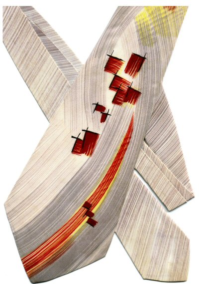
This is an example of a quite different style of 40's era tie that I have enjoyed collecting. No shiny sheen with elaborate brocade woven into the fabric here. Instead, we have a more matte type of finish, featuring a sort of swirled background with free-flowing lines, on top of which are abstract colorful blotches of somewhat geometric design.

I don't remember when or where I obtained this tie. It might be another eBay purchase, I just can't recall. I have a few others in a similar style, and plan to put another of them up next week.

The tie has no labels, but inside both ends, the large end and the small end, on the lining fabric, is stamped the initials CWH. I would guess that these were put there by the tie's original owner, but I don't really know. They could be a maker's mark, I suppose, but not like one I've seen before.

This tie definitely shows its age, with some staining and wear. But it's still quite a dashing example of 40's style, and one that I get a kick out of wearing.

Sunday, March 19, 2006

Red with Golden Globes

This is probably my favorite vintage tie in red. I'm not quite sure what it's supposed to be depicting. Some kind of fruit, I suppose, with leaves connecting them. It reminds me of the verse from Psalms (or is it Proverbs?) "A word fitly spoken is like apples of gold in pictures of silver." I just checked the King James Bible via a quick Google search, and it's Proverbs 25:11. I had a grade school teacher who loved to quote that verse, and did so incessantly.

I bought this tie early in my collecting life, during my college years, when I used to haunt the St. Vincent de Paul and Salvation Army stores in Walla Walla, Washington. Good vintage ties could often be found there, and I rarely had to pay more than a dollar or two for them.

I used to have a wonderful 40's era suit to go with this tie. I bought the tie first, and later bought the suit to go with it, which fact I was happy to impart to anyone I could get to listen. Paid $5.00 for the suit as I recall. It was off white, thick bulky wool fabric, with lots of colorful threads imbedded in it, the predominant color of which was a deep red perfectly matching this tie.

Actually, I think the suit is still in a box out in my garage somewhere, but unfortunately, my waistline expanded over the years, and I havn't been able to fit into that suit for years, and I'm don't suppose I ever will again. I should sell my old suits on eBay, I suppose. I had half a dozen 40's and 50's era suits. They were sure fun to wear! The ties still are. I wore this one to church today.

The tie has no sewn in labels, but it has a label printed directly on the fabric on the back that simply reads "HABAND." The brocade pattern consists of large squares, each of which contains 6 by 6 rows of tiny squares inside it. The squares are tipped onto the perpendicular.

Sunday, March 12, 2006

Red and Blue Diagonals

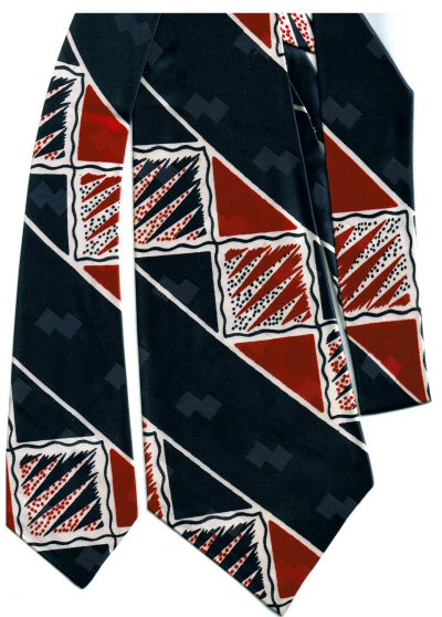
Blue and red combined seems to be a favorite color combination for 1940's era ties. I've already posted one example, Dad's red and blue paisley. Here is another favorite of mine utilizing a similar color palette.

This one, if I remember correctly, I purchased on eBay back in the late 90's, probably 1998. That was when I made my first foray into online purchasing. I had fun buying several lots of vintage ties, also some stamps. My stamp collecting is relatively desultory, more off than on, but given more money, and more time, I'm sure I could spend more on both (stamps and ties).

This tie has a nice, albeit minimalistic brocade pattern, barely visible in the scan, if you look closely, consisting of paired squares, turned on their side, diagonally, reflecting the dominant pattern of the tie itself. That pattern of diagonals is laid out in diagonally oriented stripes.

How much more interesting this tie, however, than the typical plain colored stripes that are so prevalent in conservative ties: yesterday, today, and one assumes, tomorrow! Boo to those boringly traditional stripes, and hooray for colorful well-designed ones like these!

Sunday, March 05, 2006

Orange Pseudo-Books and Vines

I have an entire rack of vintage ties in shades of orange and brown, of which this is one of my several favorites. I particularly like this tie because the featured rectangular shapes are reminiscent of books, even though in all honesty, I'm forced to admit they probably aren't intended to BE books. Close enough for me, the inveterate bookworm and librarian.

What more can one say about it? It has a lovely swirling ribbon brocade, which may be intended to depict vines and leaves in an abstract fashion. If you look very closely, right at the bottom of the bright orange bookish object, for instance, or right above and impinging on the top of the same object, you may be able to see what appear to be leafish objects curving off one of the ribbon vines.

Unfortunately, I don't remember where or when I obtained this tie. The label reads:

"Wembley"
"Reg. U.S. Pat. Off."

which leads me to wonder just what aspect of a tie is patentable.

Sunday, February 26, 2006

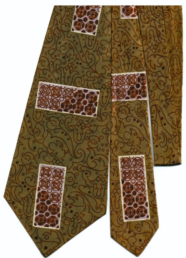
Olive and Burgundy Arabesque

This tie was purchased in California, at an antique store in downtown Santa Cruz, if I remember correctly. That would have been in 1996 or 1997, whichever year ALA (the American Library Association) held its annual conference in San Francisco.

Arline and I went, my trip paid by my employer of the time, Amigos, and Arline getting at least part of her expenses paid by her employer, SMU (Southern Methodist University). We stayed on for a week after the conference, and after spending a couple of days doing the tourist thing in San Francisco, traveled on down to San Jose by train, where Arline's sister Kathy and her husband Ken, picked us up and took us over the mountain to Santa Cruz, where they still live to this day.

Arline had seen this tie when she had been there a year before, but had selected a different one to buy for me as a gift. When we visited the store again (again for them, first time for me) this tie was still there, and I coveted it, and so bought it, rather than risk breaking the 10th commandment.

Unfortunately, I'm not sure if the scanned image will allow you to see the brocade pattern which consists of closely spaced circular dots of variing sizes. They are mirrored by the maroon circular patterns contained in the rectangular boxes. The tie has a label which reads "made and styled in california for Penney's".

Sunday, February 19, 2006

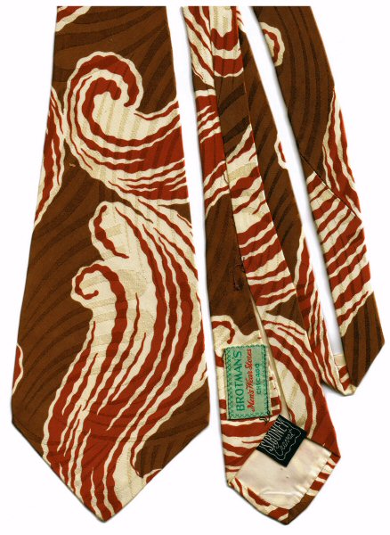
Rust and cream swirl

This tie gains excitment via its dramatic rust and cream swirl on a background of basic brown with a horizontally flowing linear brocade pattern. It is a relatively recent addition to my collection meaning that I acquired it sometime within the past decade or so, rather than early in my collecting career.

Beyond that, there's not really much to say about it. I don't remember the exact particulars of where and when i acquired it. It might be one that my wife found in her peripatetic perigrinations through the second-hand shops and antique venues in whatever towns we found ourselves inhabiting or visiting. Junk stores, we call them, and checking them out has always been one of our forms of entertainment.

The green label reads "BROTMAN'S Men's Wear Stores Chicago" while the black one elegantly asserts "SIBONEY Cravat."

Sunday, February 12, 2006

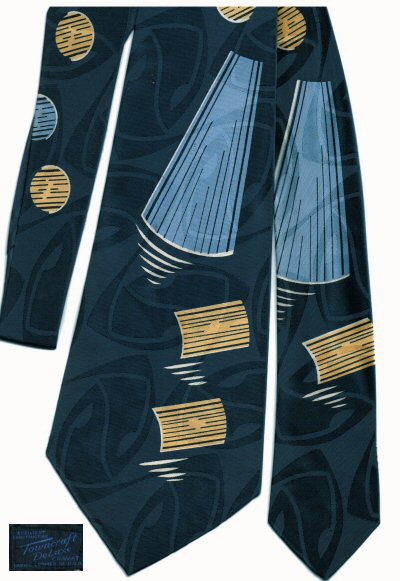
Navy with lighter blue and yellow

This is my favorite navy blue exemplar. Why? Several reasons:

  • The light blue patches make it easier to match it up with an outfit: light blue shirt, navy slacks, etc.
  • The yellow spots make a nice contrast to the blue, and help give the tie definition against the shirt
  • The lovely abstract brocade woven into the fabric is an especially nice touch

It's just a beautiful tie all the way around.

BTW, the blue blob in the lower left corner is the tie's label. If you click on the image, you'll get a slightly larger version in your browser, but the label is still difficult to read. The label states
"Resilient Construction"
"Towncraft DeLuxe Cravat"
"Fabric Loomed in U.S.A."

Sunday, February 05, 2006

Light blue floral

This is another of my wife's favorites. Mine too, for that matter.

What makes it unique is the lighter blue shade which predominates. By far the vast majority of vintage blue ties I own are deep dark navy blue. Deep blue and red together (as in Dad's red and blue paisley) are a typical combination as well. But lighter shades of blue are less common, at least in MY collection.

This tie poses a problem for modern wardrobes. It is really difficult to find a shirt color that it goes with, other than pure white. Of course, in the 40's, when these ties were designed and manufactured, white was the just about the ONLY color of dress shirt worn by men. But nowadays, I personally try to avoid white shirts as much as possible. So wearing this particular tie is always a challenge. But definitely worth the effort.

Sunday, January 29, 2006

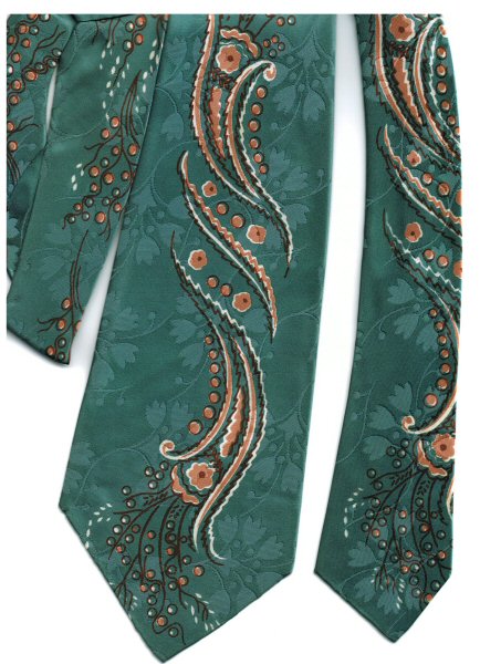
Teal and Orange

This is my wife's favorite tie from my collection. It's certainly one of my favorites, too. I chose to load it this week be-
cause it is sort of the color reverse of last week's exemplar. While last week's tie was orange with a teal highlight, this one is teal with orange highlights!


It's certainly a gorgeous tie, with a rich brocade background pattern of floral bells and dots, with comple-
mentary sprays at the ends of the stylized orange floral design.


Sunday, January 22, 2006

Orange Swordfish

Actually, it's the tie that's orange, not the swordfish. I refer to this tie as the "orange swordfish" tie because it (the tie) is orange, and it has a swordfish on it. The swordfish is more of a teal or turquoise color.

This is definitely one of the more brilliantly colored, some might even say, garishly colored ties in my collection. Originally, it was even more gaudy than it is now, in that the fish was covered with glitter. Over the years, most of the glitter has worn away, and it no longer has quite the sparkle it must have once boasted. Nevertheless, it still manages to shock the eyes, at least a little.

Sunday, January 15, 2006

Shades of Purple

This was the first tie I ever purchased as I was beginning my vintage tie collection. During the summer after my high school graduation, my Mom and I went into Portland to find a used typewriter for me to use during college.

Across the street from the typewriter store was an antique store of some sort, perhaps a vintage clothing store, I don't recall. At any rate, this tie was one of a pair of vintage beauties displayed in the window.

I persuaded my Mom to let me go in and buy both of them. I don't recall exactly how much they were, but I'm guessing not more than $3-$5 apiece.

The other tie, a brilliant red one, I later lost. But this one remains one of my favorites, and is almost the only vintage tie I own that comes in shades of purple. You can see that it, too, comes with a beautiful floral brocade pattern woven into the background fabric.

The labels read as follows: "Wilson's W Shirt Shop Inc. 536 Broadway at Alder Portland, Oregon. Fashion Craft SN Cravats" (the "SN" is enclosed in a diamond shape, probably indicating a logo). This is the same "makers mark" label as Dad's blue and red paisley! Most of my ties that HAVE labels, have two: one representing the venue in which the tie was sold, the other indicating the manufacturer or designer.

Sunday, January 08, 2006

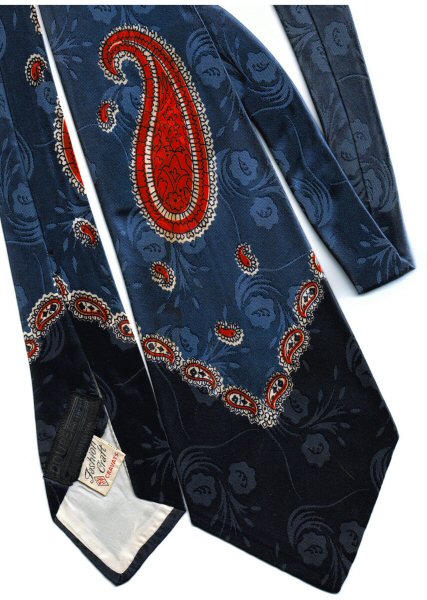
Dad's Red and Blue Paisley

I became interested in vintage ties during high school, when a fellow classmate showed off his father's incredible tie collection by wearing them to school. As I recall, he even had some zoot suit ties, which were literally as wide as the front of your shirt, and incredibly brilliantly colored.

I promptly went home and asked my Dad if HE had any old ties. And lo and behold, yes, he did! This red paisley on a navy blue background was one of them, and remains one of my favorites to this day. You can also see quite clearly the gorgeous floral brocade pattern in the background.

I had never seen my father wear any of these vintage ties; he had long since given them up for the conservative look of the 50's and 60's. It has always been hard for me to imagine him as a stylish young buck, decked out in a tie like this!

As I recall, there were about a dozen or so. I took them all off to school, and wore them with pride. Later, my mother suggested I let my two younger brothers have some of them, and I reluctantly divided them up between the three of us. Unfortunately, both of them were still living at home when the old farmhouse burned to the ground, and only the three I had away with me were saved for posterity.

The tie's labels read "DOUPE BROTHERS Ilwaco, WN." and "Fashion Craft SN Cravats."

Sunday, January 01, 2006

Chess brocade

This is my brand new blog devoted to showing off images of my vintage necktie collection. I plan to post about one tie per week. At this rate it will take several years to showcase my entire collection.

This particular tie is one of the more flashy examples I have been fortunate enough to acquire. It is fully 4 1/2 inches wide at its widest point, and has a gorgeous background brocade pattern of chess pieces, which may not be as visible as one could wish in the scanned image. This is a classic 1940's era tie at its best.